19 Julia统计图形–Plots库
19.1 介绍
Julia语言没有内建作图能力, 作图需要通过扩展包提供, 因为Julia语言的历史还比较短, 现在有多种作图用的扩展包但是没有一个占绝对优势的包。 比较常用的有Plots, Makie, Gadfly, PyPlot包。 其中Makie出现较晚,功能比较强大,后端安装容易。
本文演示Plots包。参见:
Plots包可以调用多个不同的绘图软件包作为后端, 提供统一的调用界面。 因为Julia的软件环境还不够成熟, 经常会有某些软件包因为软件环境或者兼容性问题而不能运行, Plots包则可以不用修改程序地换用其它的绘图后端。 GR后端的兼容性较好, PyPlot包需要安装兼容的Python, 功能更强。
Plots使用GR后端测试:
using Plots
Plots.gr()
Plots.plot(Plots.fakedata(50, 5), w=3)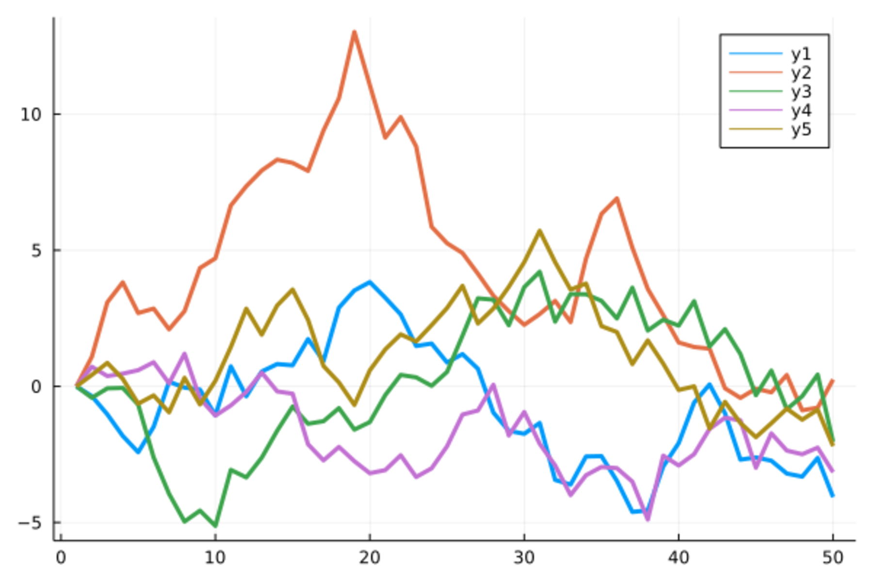
Plots包定义了plot()函数等多个绘图函数,
用统一的语法格式调用不同的绘图后端作图。
事实上,
Julia的许多作图扩展包都使用plot()函数名,
所以很容易发生名字冲突。
可以用Plots.plot()避免冲突,
如果没有其它作图包,
可以直接使用plot()。
作图需要用一些例子数据。
如下的class.csv中包含了19个学生的姓名、性别、年龄、身高、体重信息:
name,sex,age,height,weight
Sandy,F,11,130,23
Karen,F,12,143,35
Kathy,F,12,152,38
Alice,F,13,144,38
Becka,F,13,166,44
Tammy,F,14,160,46
Gail,F,14,163,41
Sharon,F,15,159,51
Mary,F,15,169,51
Thomas,M,11,146,39
James,M,12,146,38
John,M,12,150,45
Robert,M,12,165,58
Jeffrey,M,13,159,38
Duke,M,14,161,46
Alfred,M,14,175,51
William,M,15,169,51
Guido,M,15,170,60
Philip,M,16,183,68
读入:
using CSV, DataFrames
d_class = CSV.read("class19.csv", DataFrame)
19 rows × 5 columns
| name | sex | age | height | weight | |
|---|---|---|---|---|---|
| String7 | String1 | Int64 | Int64 | Int64 | |
| 1 | Sandy | F | 11 | 130 | 23 |
| 2 | Karen | F | 12 | 143 | 35 |
| 3 | Kathy | F | 12 | 152 | 38 |
| 4 | Alice | F | 13 | 144 | 38 |
| 5 | Becka | F | 13 | 166 | 44 |
| 6 | Tammy | F | 14 | 160 | 46 |
| 7 | Gail | F | 14 | 163 | 41 |
| 8 | Sharon | F | 15 | 159 | 51 |
| 9 | Mary | F | 15 | 169 | 51 |
| 10 | Thomas | M | 11 | 146 | 39 |
| 11 | James | M | 12 | 146 | 38 |
| 12 | John | M | 12 | 150 | 45 |
| 13 | Robert | M | 12 | 165 | 58 |
| 14 | Jeffrey | M | 13 | 159 | 38 |
| 15 | Duke | M | 14 | 161 | 46 |
| 16 | Alfred | M | 14 | 175 | 51 |
| 17 | William | M | 15 | 169 | 51 |
| 18 | Guido | M | 15 | 170 | 60 |
| 19 | Philip | M | 16 | 183 | 68 |
19.2 折线图
折线图的基本格式是plot(x, y)。
可以用linewidth=指定线粗细,
color=指定颜色(符号、字符串等),
label=指定图的图例文字。如
dtmp = copy(d_class)
sort!(dtmp, :height)
plot(dtmp[:, :height], dtmp[:, :weight],
  color=:blue, linewidth=2, label="Weight vs. Height")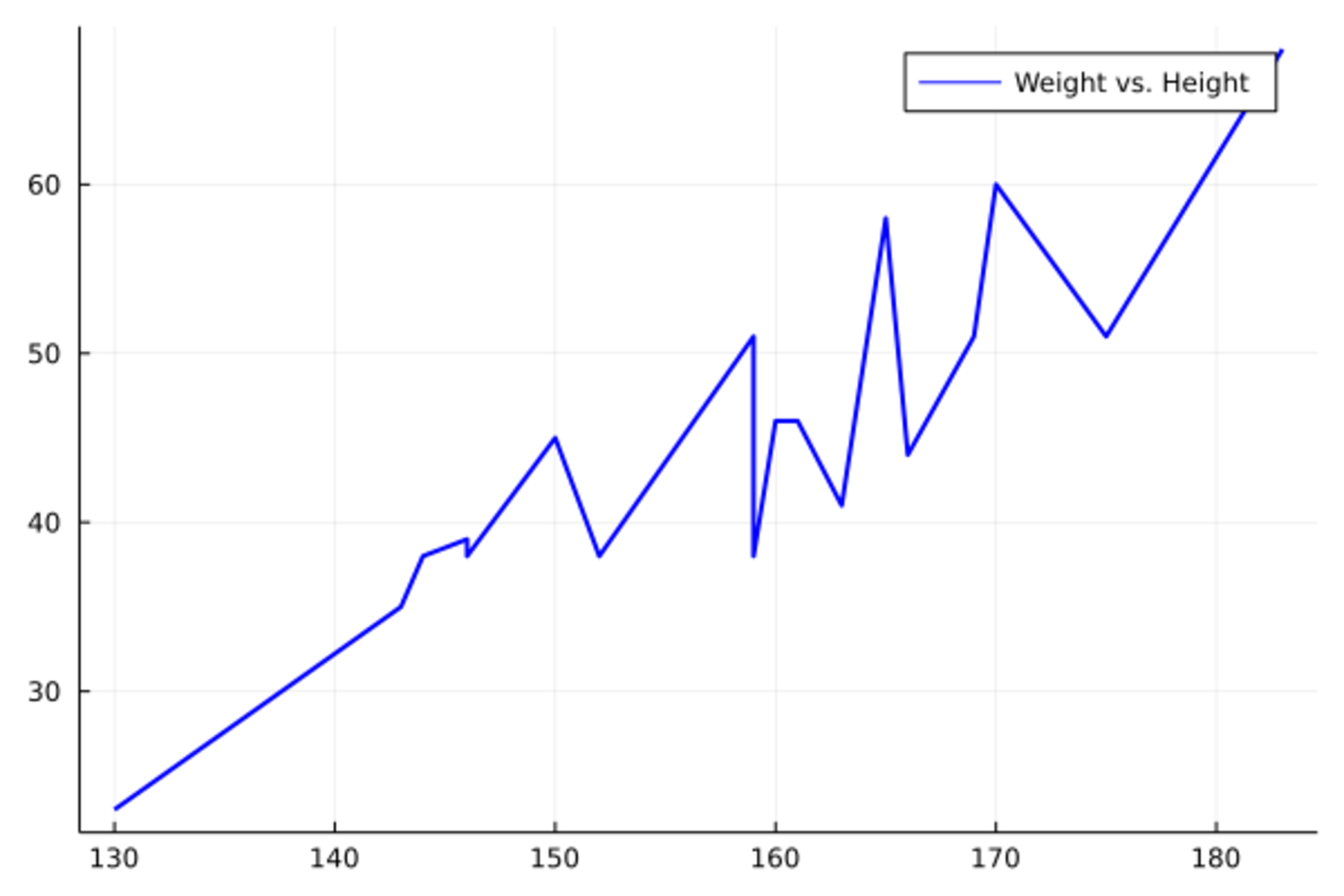
对光滑曲线, 均匀布点作折线图就可以看作是曲线图,如
x = range(0; stop=10, length=200)
y = sin.(x)
plot(x, y, color=:blue, linewidth=2, label="sin(x)")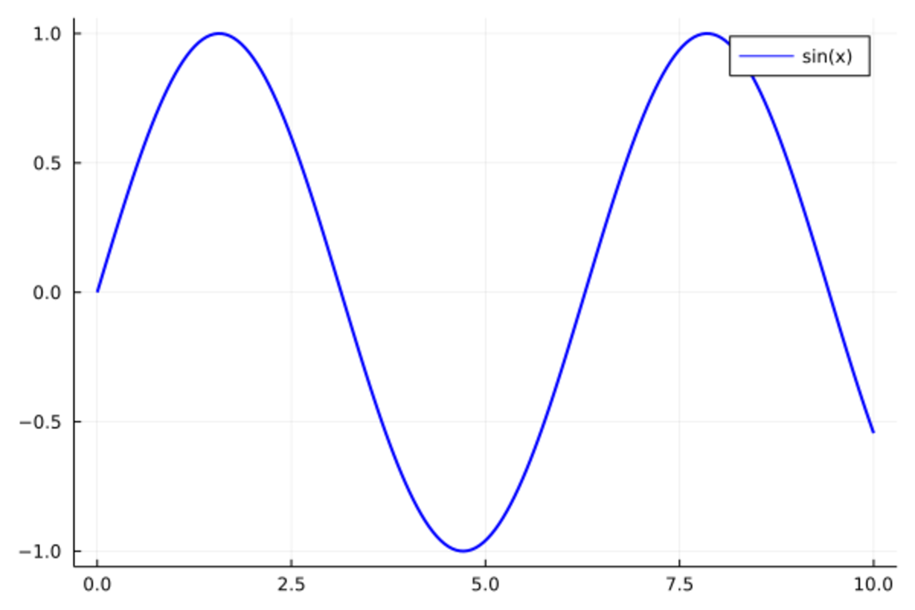
可以用xlabel指定x轴标题,
用ylabel指定y轴标题,
xticks指定x轴刻度点,
用yticks指定y轴刻度点,
用title指定标题,
用alpha指定透明度。
如果调用LatexStrings包,
还可以在标题、图例说明中用LaTeX格式公式。
如果不需要图例,加legend=:none选项。
如
plot(x, y, color=:blue, linewidth=2,
    xlabel="x", ylabel="y",
    label="sin(x)", title="Sine Function",
    yticks=[-1,0,1], alpha=0.5)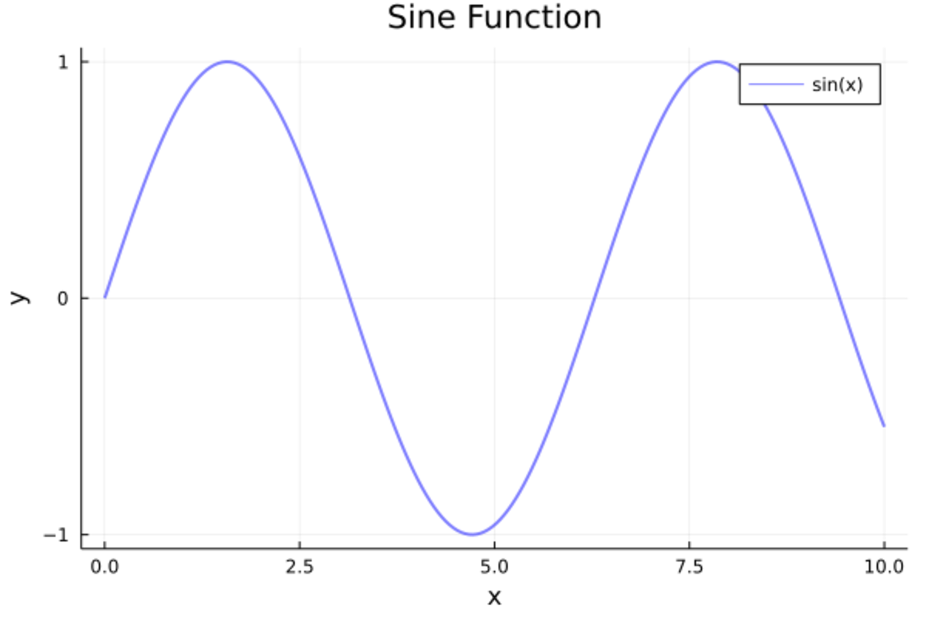
事实上,为了做函数曲线,不需要先计算坐标, 只要指定函数和x范围即可,如
plot(sin, 0, 10, title="Sine Function")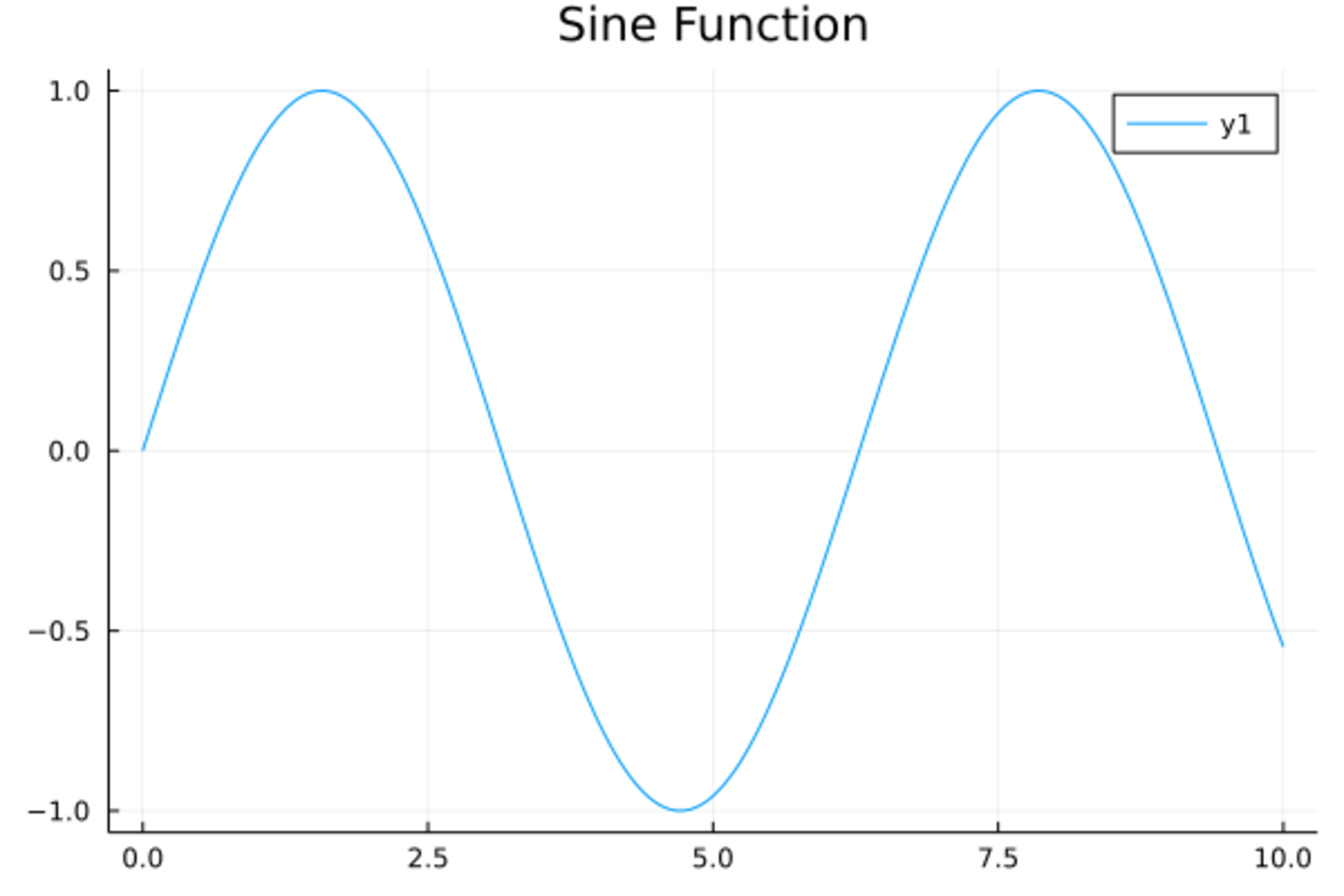
为了做多条折线图(曲线图),
只要将y变量指定为一个多列的矩阵即可。
图例说明输入为字符串行向量(单行的矩阵)。
在对多个序列作图时为了对每个序列分别使用不同的颜色、线型、线宽、符号等,
需要输入一个行向量而不是向量。
如
x = range(0; stop=10, length=200)
y = [sin.(x) cos.(x)]
plot(x, y, label=["sin" "cos"])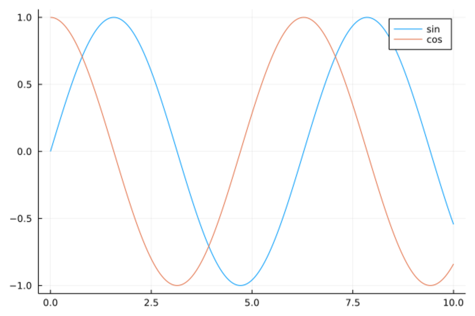
还可以用plot!()函数修改最近一幅图。
如
x = range(0; stop=10, length=200)
y = [sin.(x) cos.(x)]
plot(x, y, label=["sin" "cos"])
plot!(x, sin.(x) .^2, label="sin^2")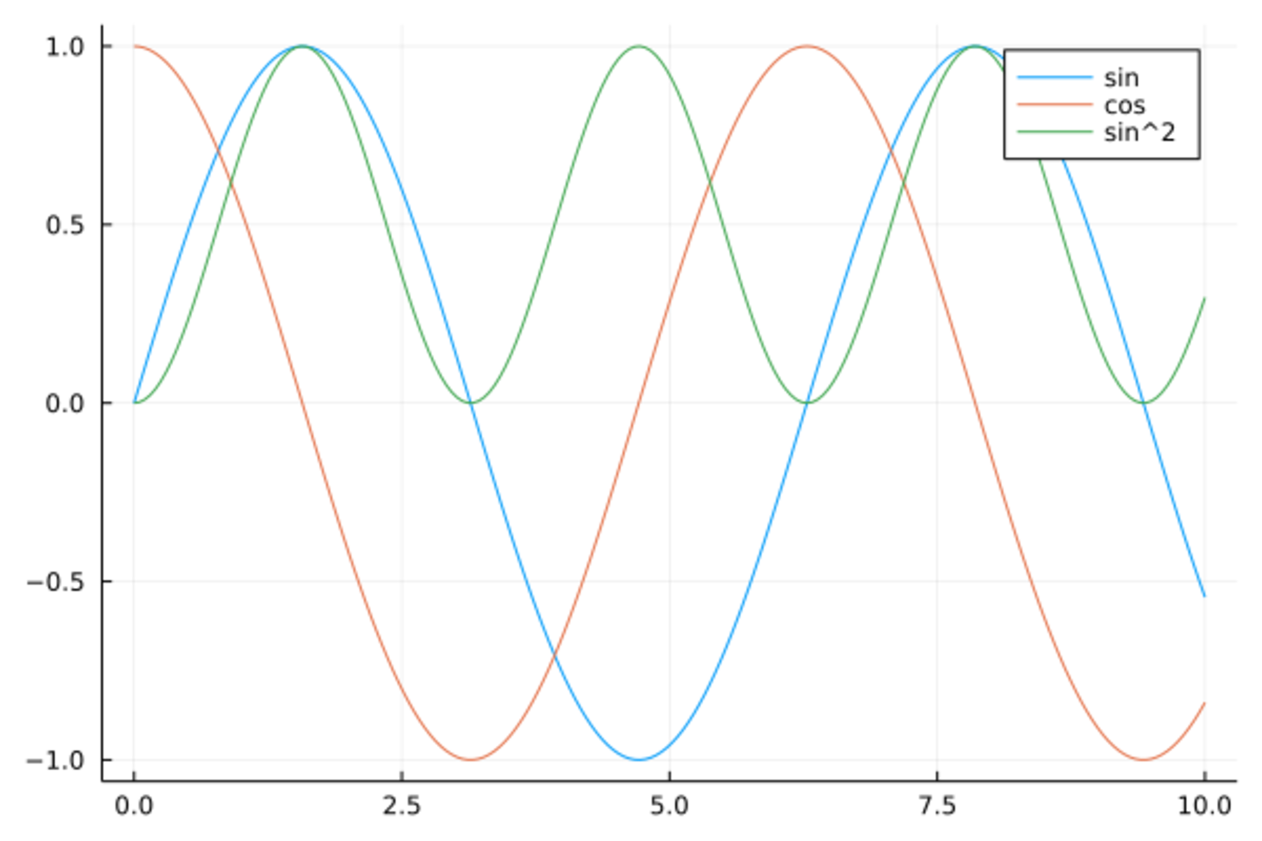
绘制折线图时,
如果需要两个点之间不相连,
办法是在这两个点中间添加一个横纵坐标都为NaN的点。
19.3 数据框中数据绘图
在StatsPlots包的支持下,
可以用比较简单的格式对数据框中的变量作图。
StatsPlots包定义了@df宏,
指定一个来源数据集后,
Plots.plot()函数中可以直接调用数据集中的变量名符号。如
using StatsPlots
dtmp = copy(d_class)
sort!(dtmp, :height)
@df dtmp plot(:height, :weight,
    xlabel="height", ylabel="weight",
    color=:blue, linewidth=2, legend=:none)
19.4 图形输出
在Jupyter中,
如果绘图后端支持,
绘图结果可以直接显示到界面的输出单元中。
可以用绘图函数的fmt参数指定图形的文件格式,如
plot(x, y, fmt=:png)。
在Juno界面, 如果绘图后端支持, 绘图结果可以直接显示到编辑器的一个窗格中。
在命令行中,
如果绘图后端支持,
绘图结果可以显示到一个单独的绘图窗口或者系统默认的浏览器中。
图形需要是像表达式一样被返回到命令行环境的,
末尾加分号的作图命令不自动显示图形,
可以将图形函数结果保存到变量中,
用show()函数显示。
比如,p01 = plot(x, y);保存图形结果为变量p01,
show(p01)则显示图形。
绘制的图形可以保存为图形文件, 不同的绘图后端支持不同的类型, 一般都支持PNG类型。
为了将最新的一幅图保存到myfig.png中,
命令如
Plots.savefig("myfig.png")如果图形保存在变量p01中,可以用
Plots.savefig(p01, "myfig.png")大多数后端还支持保存为SVG和PDF格式。
19.5 散点图
Plots.plot()函数中指定seriestype=:scatter可以做散点图。
比如,19个学生的体重对身高的散点图:
Plots.plot(d_class[!,:height], d_class[!,:weight], seriestype=:scatter)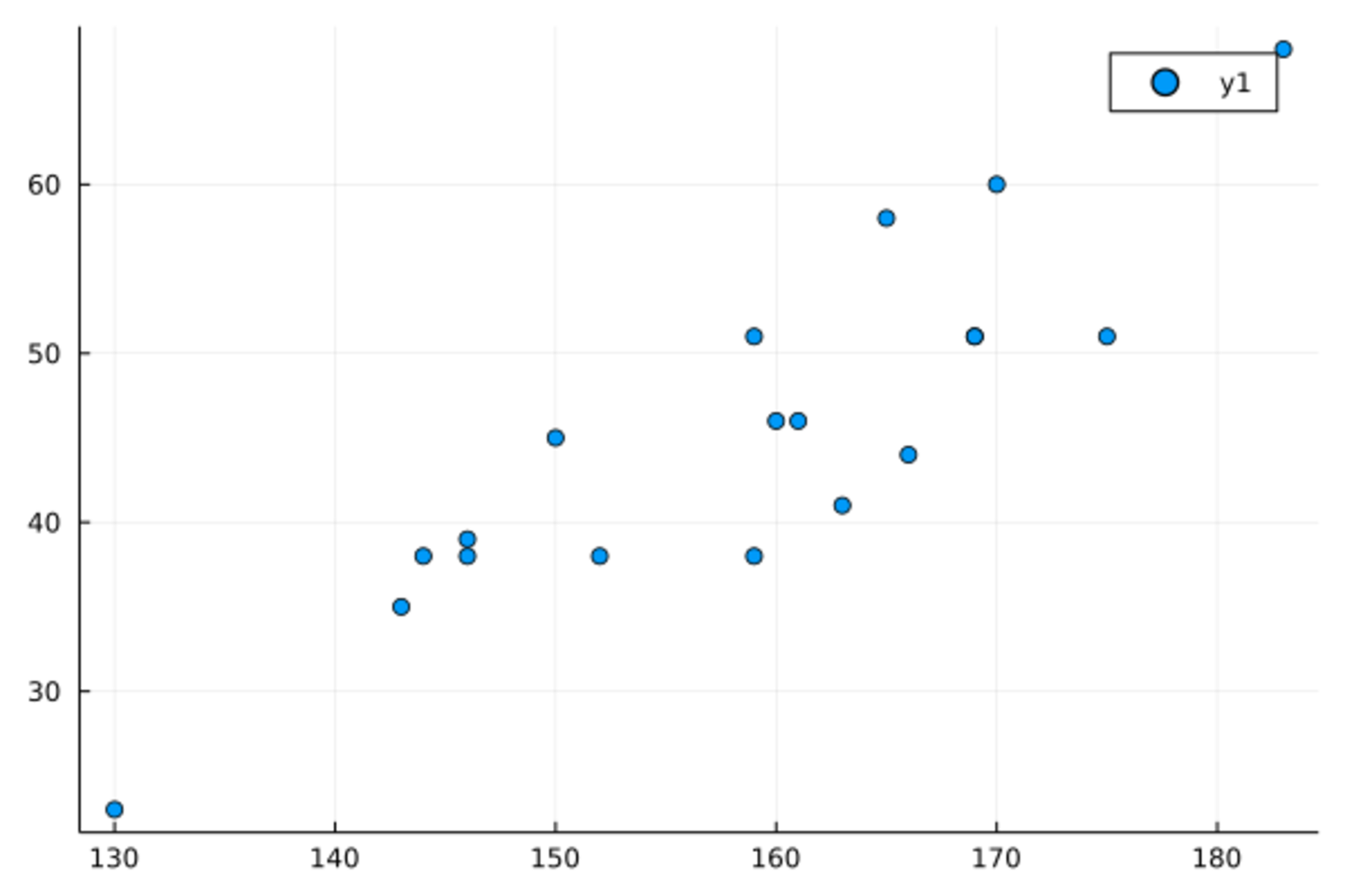
散点图的程序也可以用Plots.scatter()函数,如
Plots.scatter(d_class[!,:height], d_class[!,:weight],
    xlabel="height", ylabel="weight",
    legend=:none)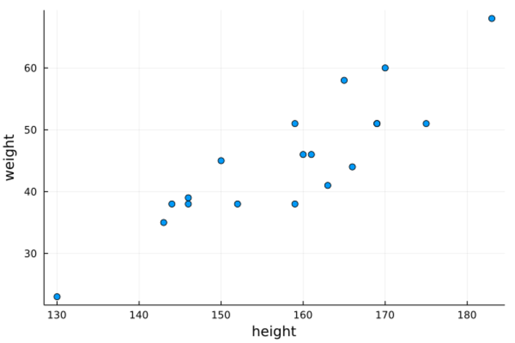
19.6 子图
Plots包支持将整个绘图页面分为若干个子窗口, 在每个子窗口中分别绘制图形。
最简单的用法是在绘图函数中使用layout=整数值,
自动将多个序列分别绘制在不同的子窗口中。
如
x = range(0.0; stop = 2pi, length=101)
y = [sin.(x) cos.(x) tan.(x) sec.(x)]
plot(x, y, layout=4)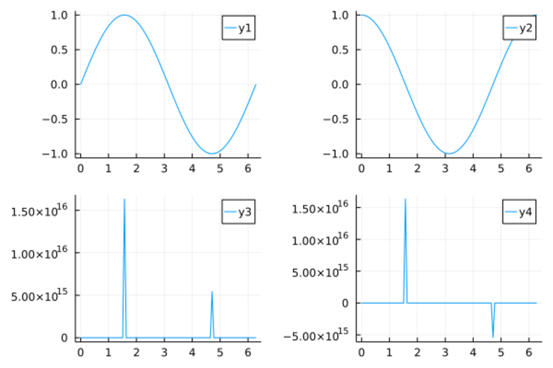
也可以给layout指定一个二元组表示子窗口的行数和列数,如
plot(x, y, layout=(4,1))
也可以将多个图形先存入变量中,
然后用plot()函数配合layout选项组合这些图形,如
p21 = @df d_class Plots.scatter(:height, :weight, label="w ~ h")
p22 = @df d_class Plots.scatter(:age, :weight, label="w ~ a")
p23 = @df d_class Plots.scatter(:height, :age, label="a ~ h")
p24 = @df d_class Plots.scatter(:weight, :age, label="w ~ a")
plot(p21,p22,p23,p24, layout=(2,2))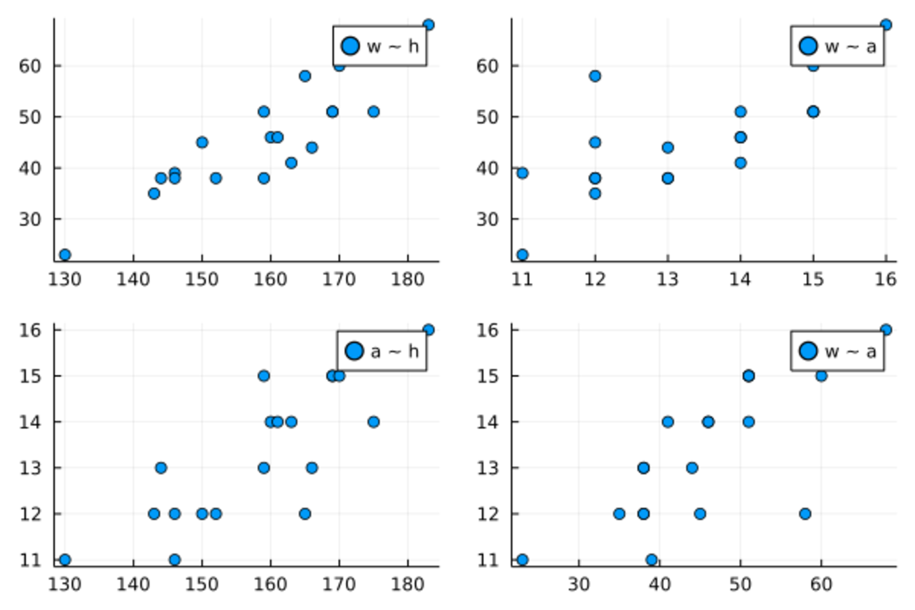
对于不等分的窗格,
可以用grid()函数给出窗格组成与长、宽信息,如
plot(rand(100,4), layout = grid(2, 2, heights=[0.3, 0.7], widths=[0.6, 0.4]))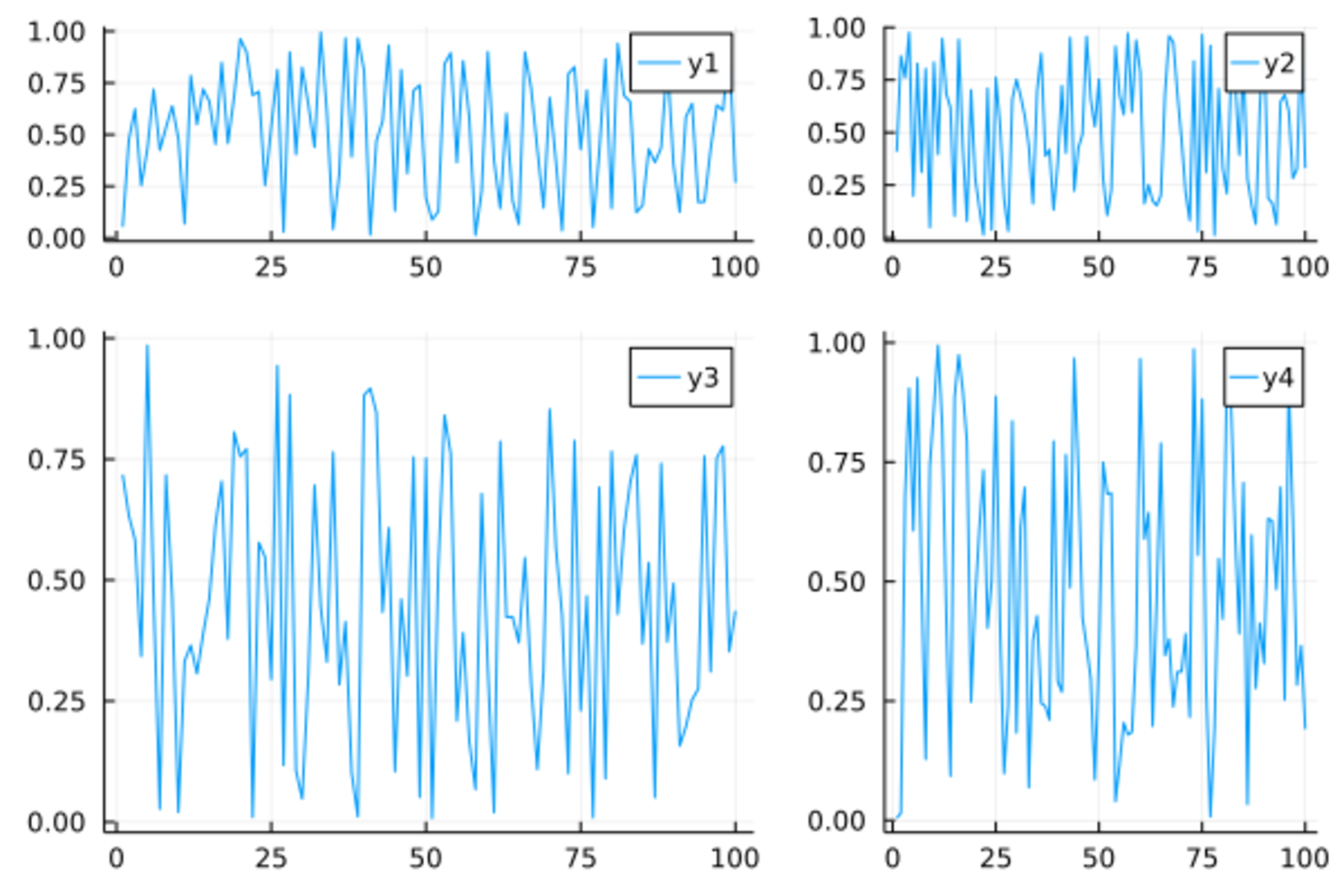
可以用@layout()宏制作用a, b, c, d表示的子窗口,
格式是矩阵格式,每个矩阵元素又可以是子矩阵,如
lay2 = @layout([a{0.1h}; b [c; d e]])
plot(randn(100, 5), layout=lay2, legend=false,
    seriestype=[:line :histogram :scatter :steppre :bar], nbins=10)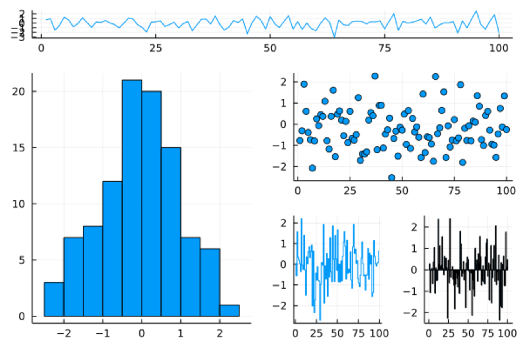
其中seriestype表示每个子窗口图形的类型,
0.1h表示a子窗口占10%高度。
更多子窗口设置比如覆盖的子窗口详见Plots库手册。
19.7 属性
plot()函数中的x和y变量是输入数据,
而一些选项如颜色、符号、线宽、图例、标题、轴刻度等是“属性”,
属性用plot()的关键字参数指定,如color=:blue。
可以用shape指定散点符号,
PlotlyJS后端支持的散点符号包括
:none, :auto, :circle, :rect, :diamond,
:utriangle, :dtriangle, :cross, :xcross,
:pentagon, :hexagon, :octagon, :vline, :hline。
其它后端需要试验或查看文档。
用markersize指定点的大小。
用color指定点和线的颜色。
用linetype指定线型(实线或者不同的虚线),如
:solid, :dash, :dot, :dashdot。
如果有多个序列, 每个序列作为输入数据矩阵的一列。 这时, 属性设置或者是统一的一个值, 或者也是多列的矩阵(行向量算作矩阵), 属性设置矩阵的每列对应输入数据的一个序列。
例如, 下面生成4条曲线的数据:
xs = 0 : 2π/10 : 2π
data = [sin.(xs) cos.(xs) 2sin.(xs) 2cos.(xs)];其中xs是一个向量,
作为统一的横坐标,
data是一个4列矩阵,
矩阵的每一列是一个序列(一条曲线的纵坐标)。
如下程序为每条曲线指定了颜色、符号:
plot(xs, data,
    label = ["sin" "cos" "2sin" "2cos"],
    shape = [:circle :cross :diamond :utriangle],
    color = [:green :orange :black :purple],
    markersize = 6)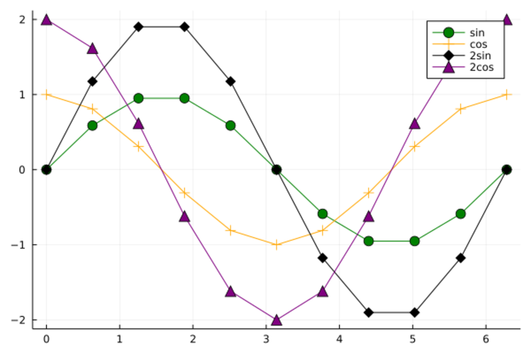
在上面程序中有4个序列,
label参数输入了一个\(1\times 4\)矩阵,
矩阵的每列对应一个序列的图例标签。
shape参数输入了一个向量,
不是多列矩阵,
所以是所有序列公用的设置,
每个序列的绘图符号都是交替使用圆点和十字。
color参数输入了一个\(2 \times 4\)矩阵,
4列的每一列对应一个数据序列,
每一列的两个颜色交替使用。
markersize输入了一个标量,
就作为4个数据序列公用。
可以区分连线颜色和散点颜色,
markercolor指定散点颜色,
linecolor指定连线颜色,如
plot(xs, data,
    label = ["sin" "cos" "2sin" "2cos"],
    shape = [:circle :diamond :diamond :utriangle],
    markercolor = [:red :yellow :brown :cyan],
    linecolor=[:green :orange :black :purple],
    markersize = 6)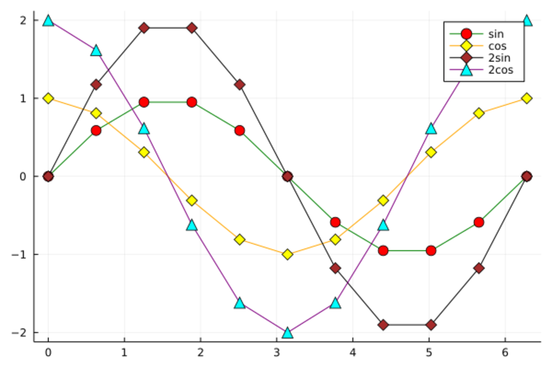
多个序列的颜色也可以不用分别指定,
而是用一个调色盘,用palette指定。
缺省值为:auto,这是根据背景色和当前的配色方案选择不同序列的颜色。
Plots包预定义的调色盘有
:blues, :viridis, :pu_or, :magma, :plasma, :inferno。
有的调色盘有可能会与背景色冲突。
详见Plots包手册的Colors章节。
如
plot(xs, data,
    label = ["sin" "cos" "2sin" "2cos"],
    palette=:blues)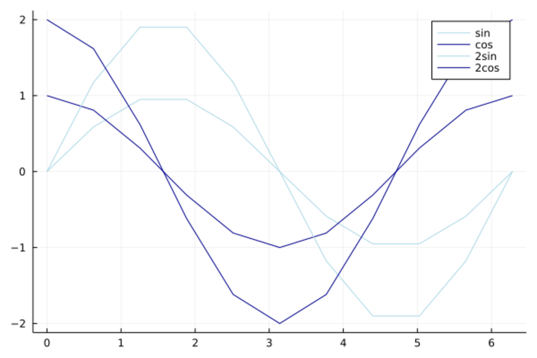
可以用xlims指定x轴范围,
xticks指定x轴刻度线位置,
xscale=:log指定x轴对数刻度,
xflip=true指定坐标轴反转方向。
用grid=false取消网格线。
如
plot(sin, 0, 2*pi, xlims=(0.0, 7.0), xticks=0:7, grid=false, legend=false)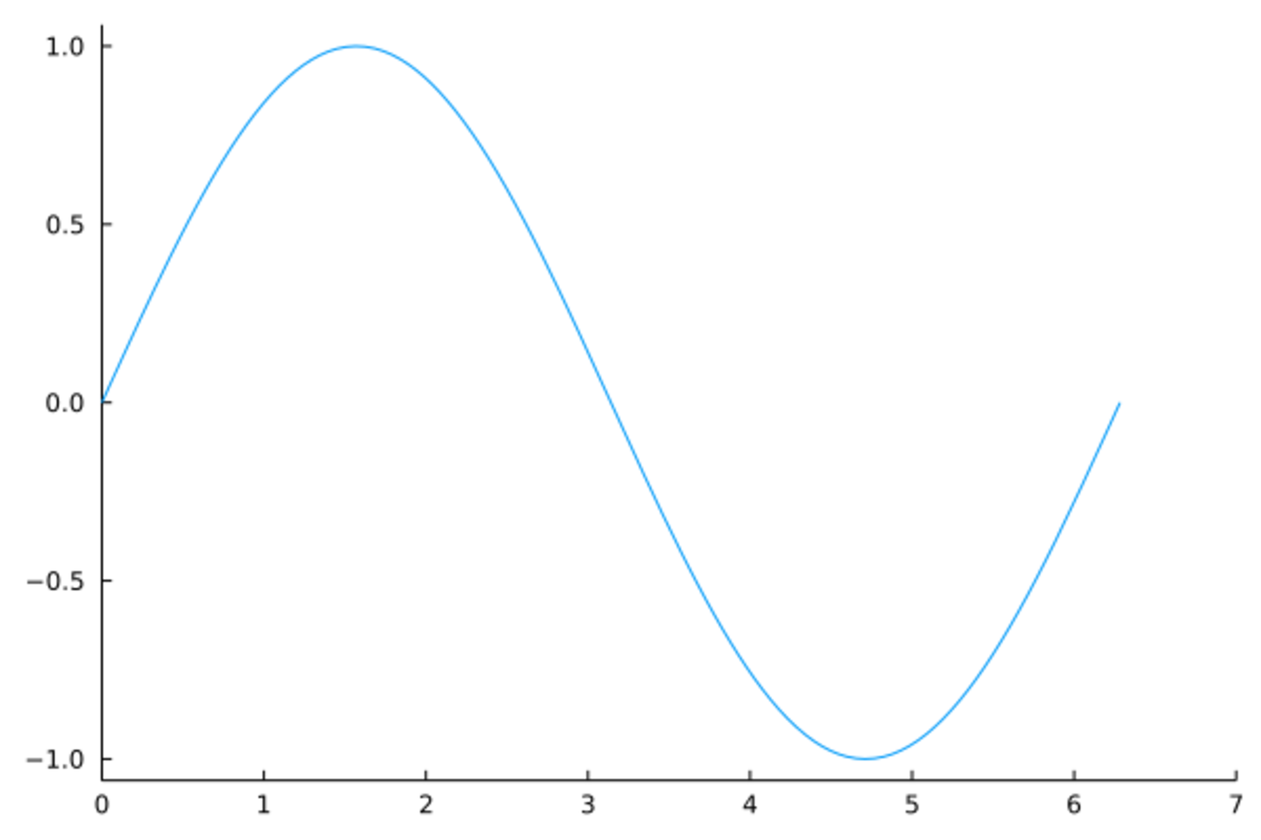
plot(sin, 0, 2*pi, xticks=(0.5pi .* (0:4), ["0", "π/2", "π", "3π/2", "2π"]))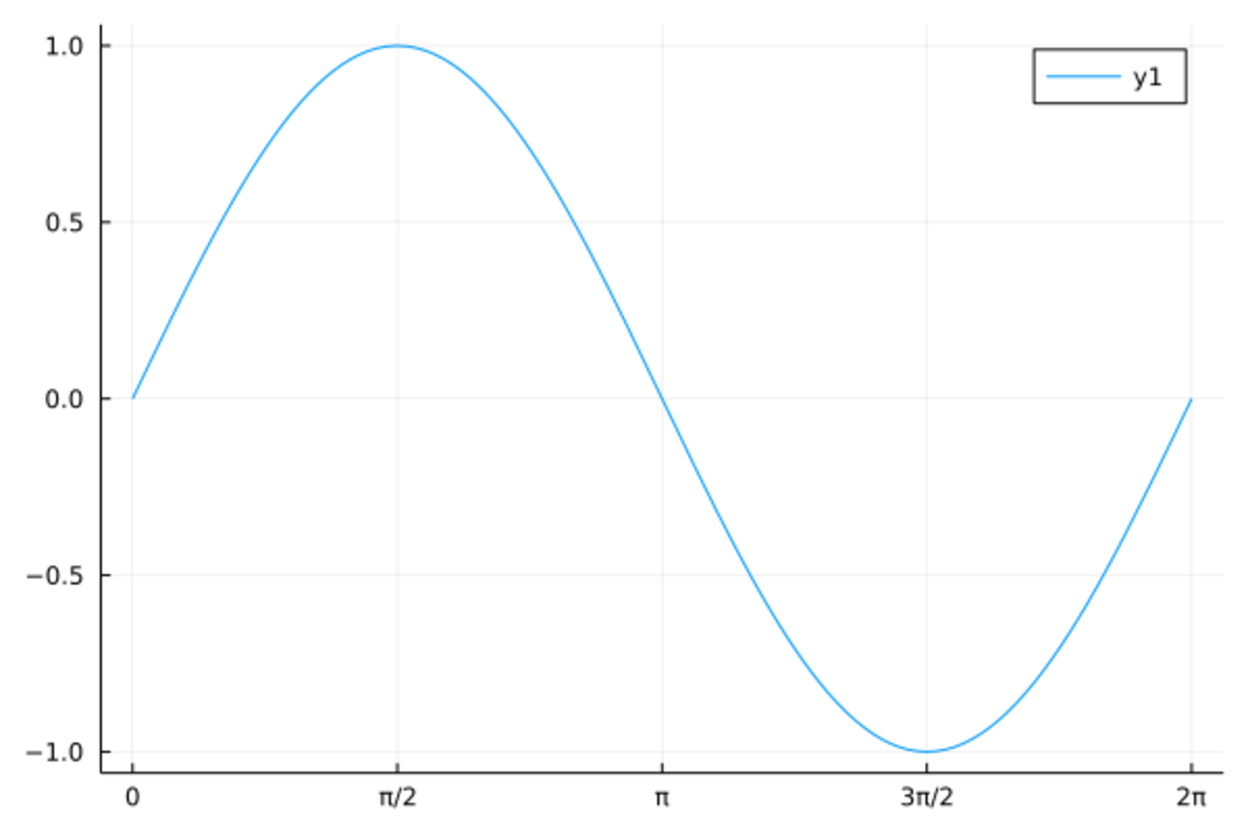
对于连线,
可以用seriestype指定不同连线方式,
如 seriestype = :steppre,
用linestyle指定线型,如:dot,
用arrow指定画箭头如:arrow,
用linealpha指定透明度如0.5,
用linewidth指定线宽(粗细)如4,
用linecolor指定线的颜色如:red。
对于散点,
可以用markershape=指定散点形状,
用markersize=整数值指定大小,
用markeralpha=小数值指定透明度,
用markercolor= 指定颜色,
用markerstrokewidth指定轮廓线粗细,
用markerstrokealpha指定轮廓线透明度,
用markerstrokecolor指定轮廓线颜色,
用markerstrokestyle指定轮廓线线型。
对于条形图之类的图形,
用fillrange指定填充范围, 如0,
用fillalpha指定填充色透明度,
用fillcolor指定填充色。
数据框变量作图示例:
@df d_class Plots.scatter(:age, [:height :weight],
    label=["height" "weight"], xlabel="age",
    color=[:green :blue],
    shape=[:cross :circle])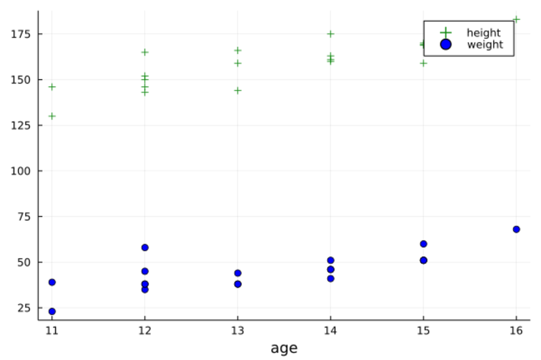
可以用group选项指定一个分组变量,如
@df d_class Plots.scatter(:height, :weight,
    group=:sex,
    xlabel="height", ylabel="weight",
    color=[:red :blue])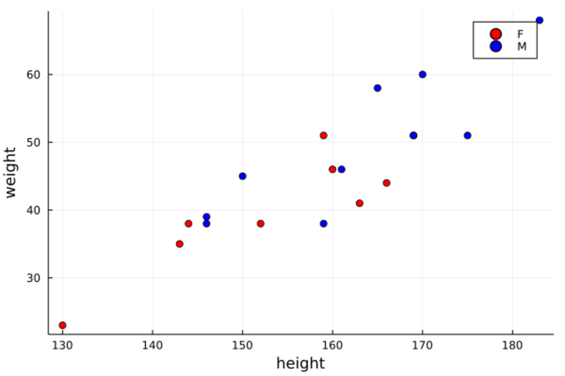
上面程序中颜色指定了两种, 输入为行向量, 使得男女两组分别用不同颜色。
可以用符号大小markersize代表数据框中第三个变量的值,如
Plots.scatter(d_class[:,:height], d_class[:,:weight],
    markersize = 2 .* (d_class[:,:age] .- 10),
    xlabel="height", ylabel="weight")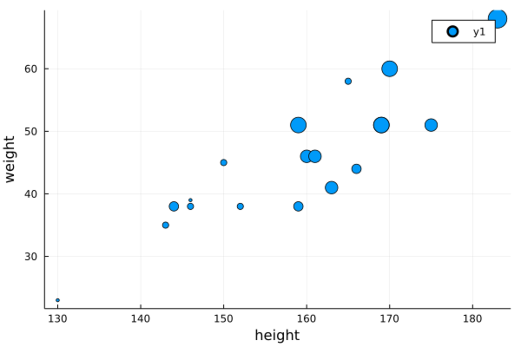
19.8 修改图形
Plots包提供了一系列函数可以在现有图形上面添加内容, 包括新的线、点、标题、注释等。 修改已有图形的函数名以叹号结尾。
如:
xs = 0 : 2π/10 : 2π
data = [sin.(xs) cos.(xs) 2sin.(xs) 2cos.(xs)];
plot(xs, data[:,1], label="sin", grid=false)
plot!(xs, data[:, 2], shape=:circle, label="cos")
scatter!(xs, data[:, 3], shape=:cross, label="2sin")
hline!([-2, -1, 0, 1, 2], label="", color=:gray90)
title!("Sine Functions")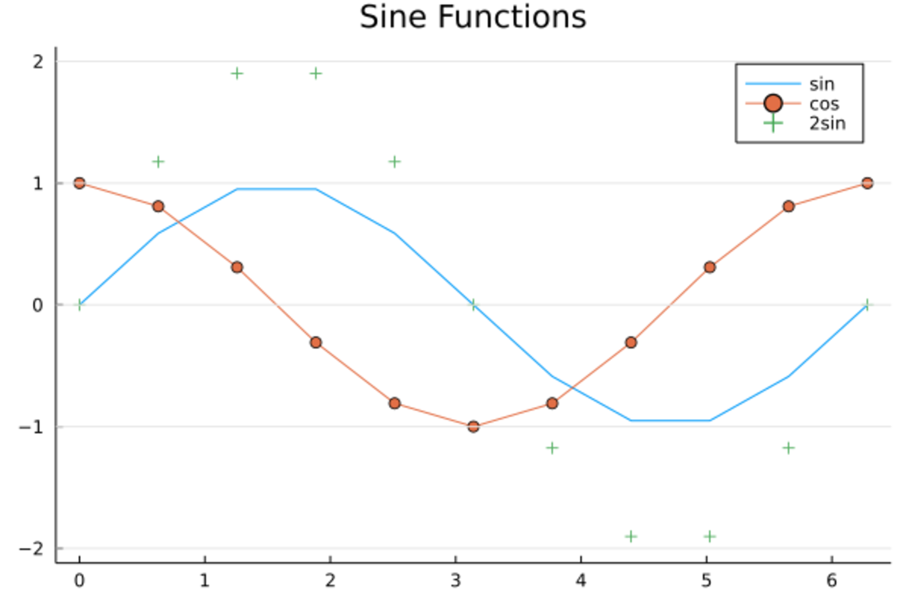
19.9 绘图类型
Plots包提供了许多绘图类型,
但是不是所有的后端绘图包都支持所有类型。
在Plots.plot()函数中可以用seriestype数据的绘图类型,
这些类型中许多还可以直接作为绘图函数,
或者函数名加叹号作为绘图修改函数。
seriestype可取值为
:none, :line, :path, :steppre, :steppost, :sticks, :scatter,
:heatmap, :hexbin, :histogram, :histogram2d, :histogram3d, :density, :bar,
:hline, :vline, :contour,
:pie, :shape, :image, :path3d, :scatter3d, :surface, :wireframe, :contour3d, :volume。
其中:line,:path, :steppre,steppost,sticks,:scatter是折线图、散点图类型。
例如,定义如下的分段函数: \[ F(x) = \begin{cases} 0 & x < 0 \\ 0.7 & x \in [0, 1) \\ 1 & x \geq 1 \end{cases} \] 这是一个右连续的阶梯函数,作图如下:
plot([-0.5, 0, 1, 1.5], [0, 0.7, 1, 1], seriestype=:steppost,
    linewidth=4, color=:orange, legend=false,
    xticks=[0, 1], yticks=[0, 0.7, 1])
scatter!([0, 1], [0, 0.7], shape=:circle, markercolor=:white, markerstrokecolor=:black)
scatter!([0, 1], [0.7, 1], shape=:circle, markercolor=:black, markerstrokecolor=:black)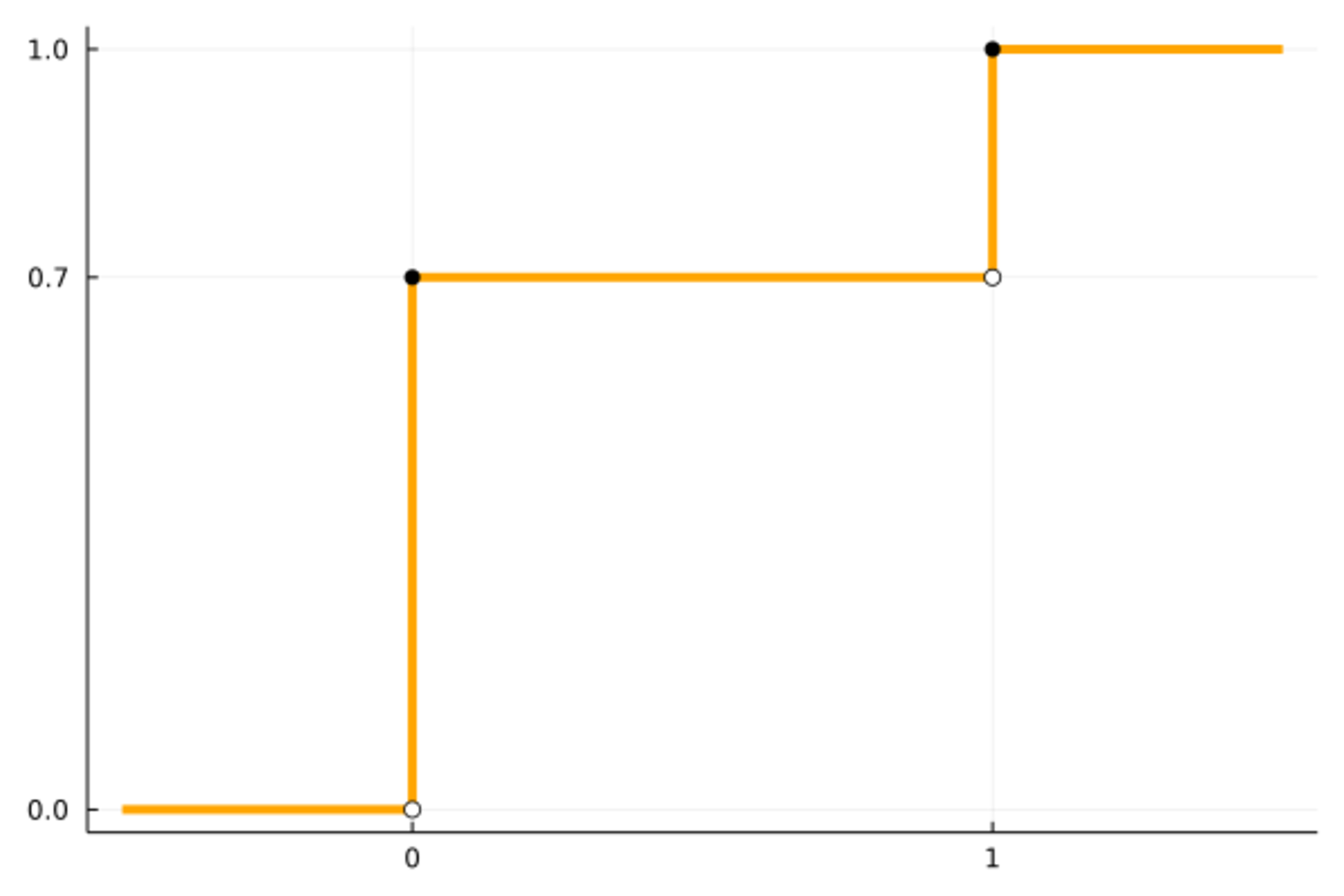
考虑离散分布的概率质量函数图形。
比如,B(20, 0.7)分布的概率质量图可以用seriestype=:sticks作图如下:
using Distributions
x = 0:20
Plots.plot(x, pdf.(Binomial(20, 0.7), x), seriestype=:sticks,
    linewidth=4, color=:blue, legend=false)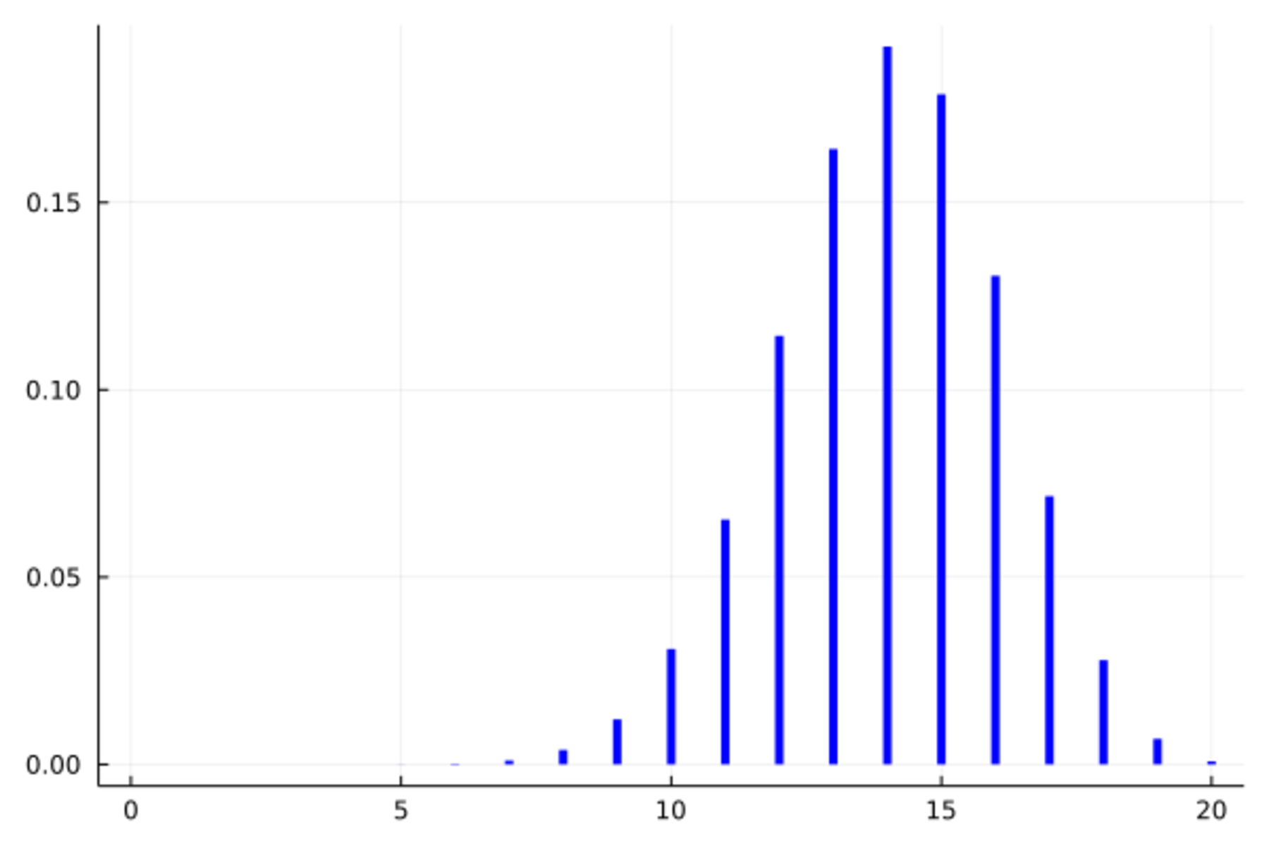
19.10 条形图
条形图是类似于seriestype=sticks的图形,
输入x坐标和y坐标对,
也可以仅输入y坐标对,横坐标为序号。
如:
Plots.bar((1:10) .^ 2, legend=false)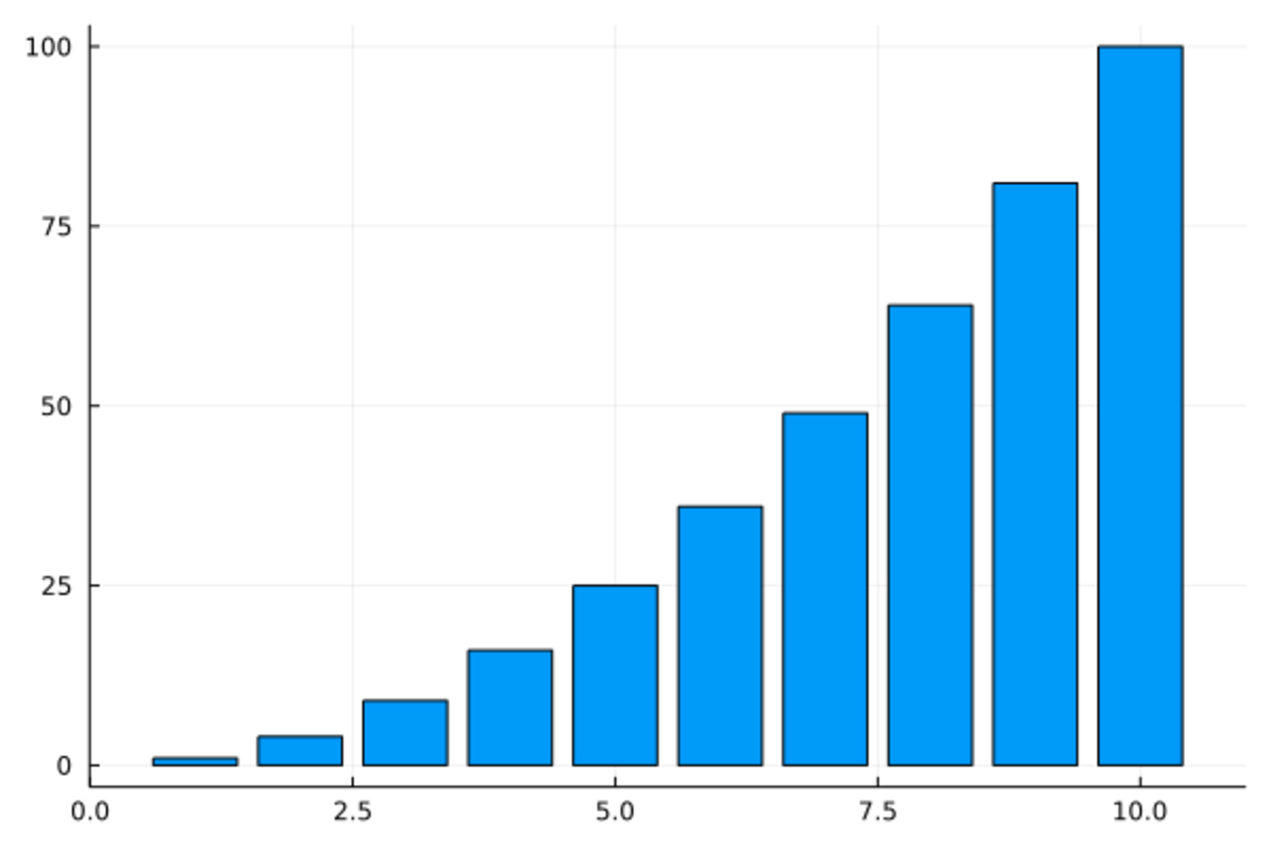
又如:
Plots.bar(1:10, (1:10) .^2, xticks=0:10, legend=false)
作条形图时如果x变量的值是字符串,
有时比较长的字符串宽度过大无法摆放,
可以加选项xrotation=60使文字倾斜摆放,如:
Plots.bar(1:10, (1:10) .^2, xticks=(0:10, string.(1000:1010)), legend=false, xrotation=60)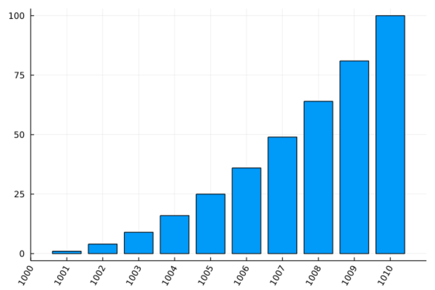
可以用fillcolor指定单个颜色,用fillalpha指定透明度,如:
Plots.bar(1:10, (1:10) .^2, fillcolor=:red, fillalpha=0.5, legend=false)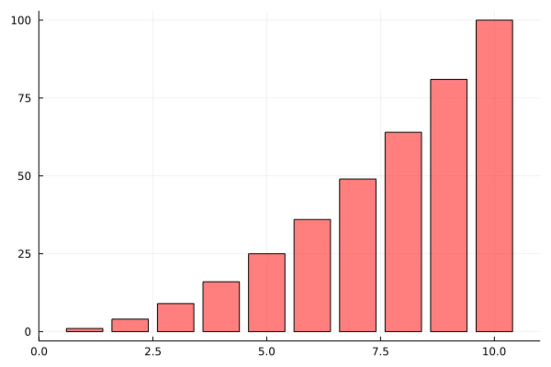
数据框中的离散变量的频数统计可以用条形图表示。 比如,19个学生的性别分布的频数条形图:
using DataFrames
dc_freq1 = combine(groupby(d_class, :sex), df -> DataFrame(Freq = size(df, 1)))
2 rows × 2 columns
| sex | Freq | |
|---|---|---|
| String1 | Int64 | |
| 1 | F | 9 |
| 2 | M | 10 |
using StatsPlots
@df dc_freq1 Plots.bar(:sex, :Freq, legend=false, bar_width=0.2)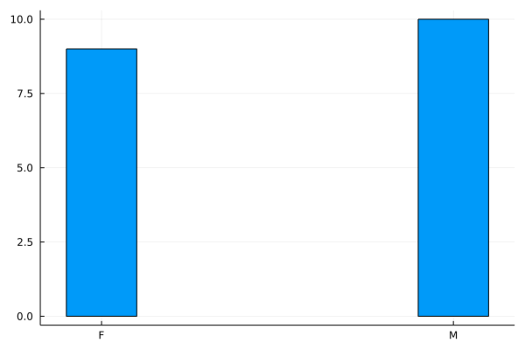
与条形图类似作用的图形是饼图,
Plots.pie()可以做饼图,如
using StatsPlots
@df dc_freq1 Plots.pie(:sex, :Freq)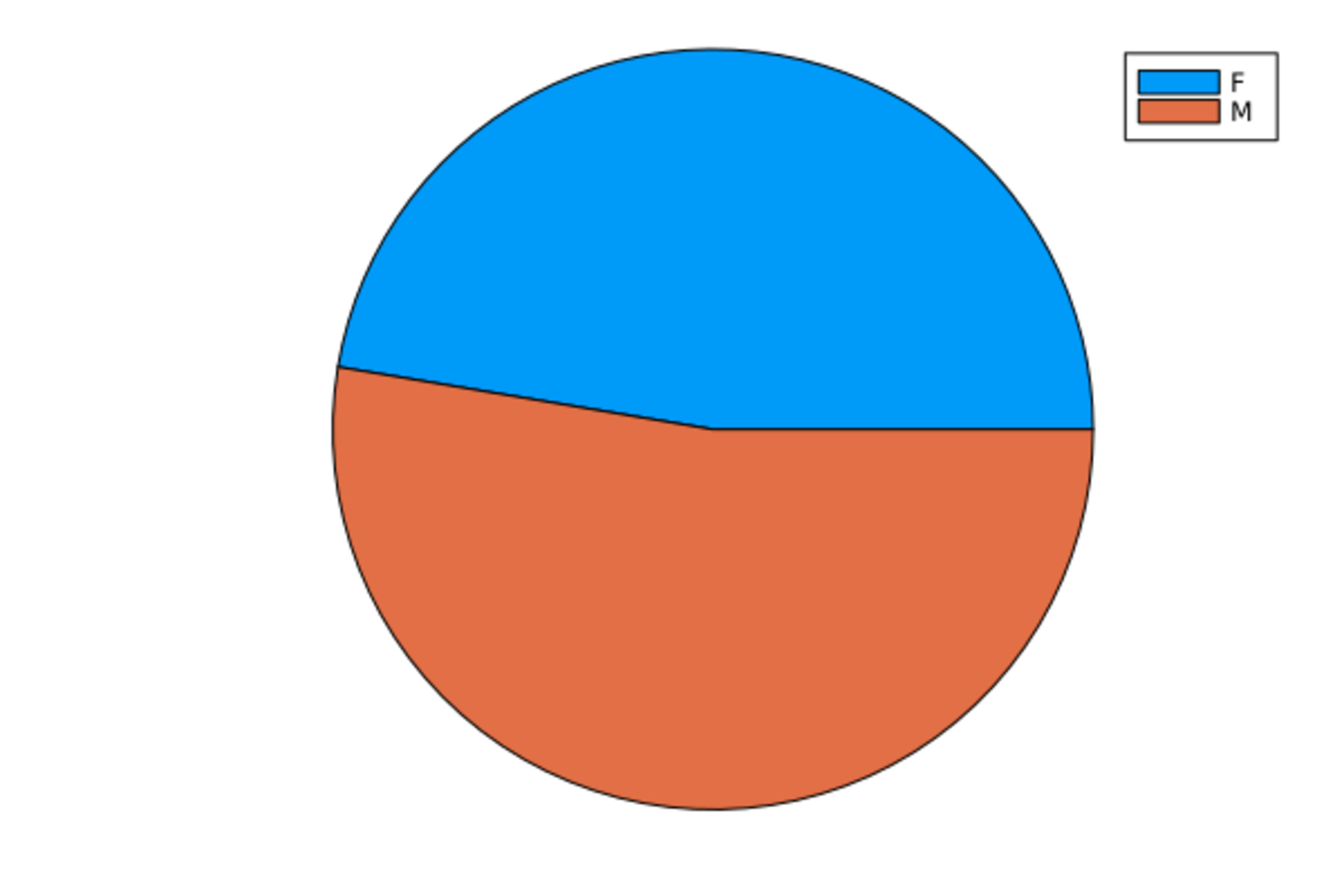
19.11 直方图
Plots.histogram(x, bins=)作直方图,
用bins=指定分组数。
如身高的直方图:
Plots.histogram(d_class[!,:height], bins=6, title="Height", legend=:none)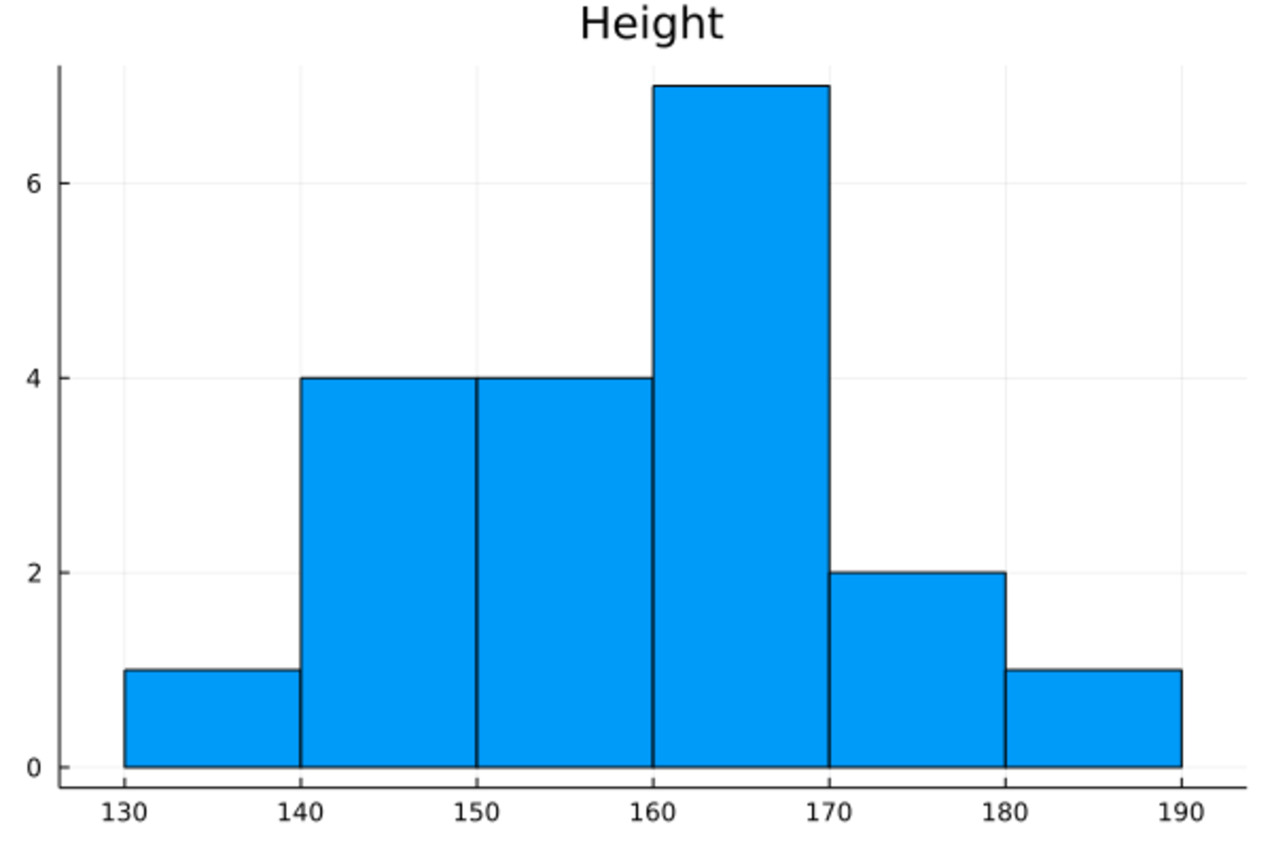
其中title=指定标题,
legend=:none取消图例。
下面是模拟的1000个正态随机数的直方图:
Plots.histogram(randn(1000), bins=50, title="Standard Normal Random Numbers", legend=:none)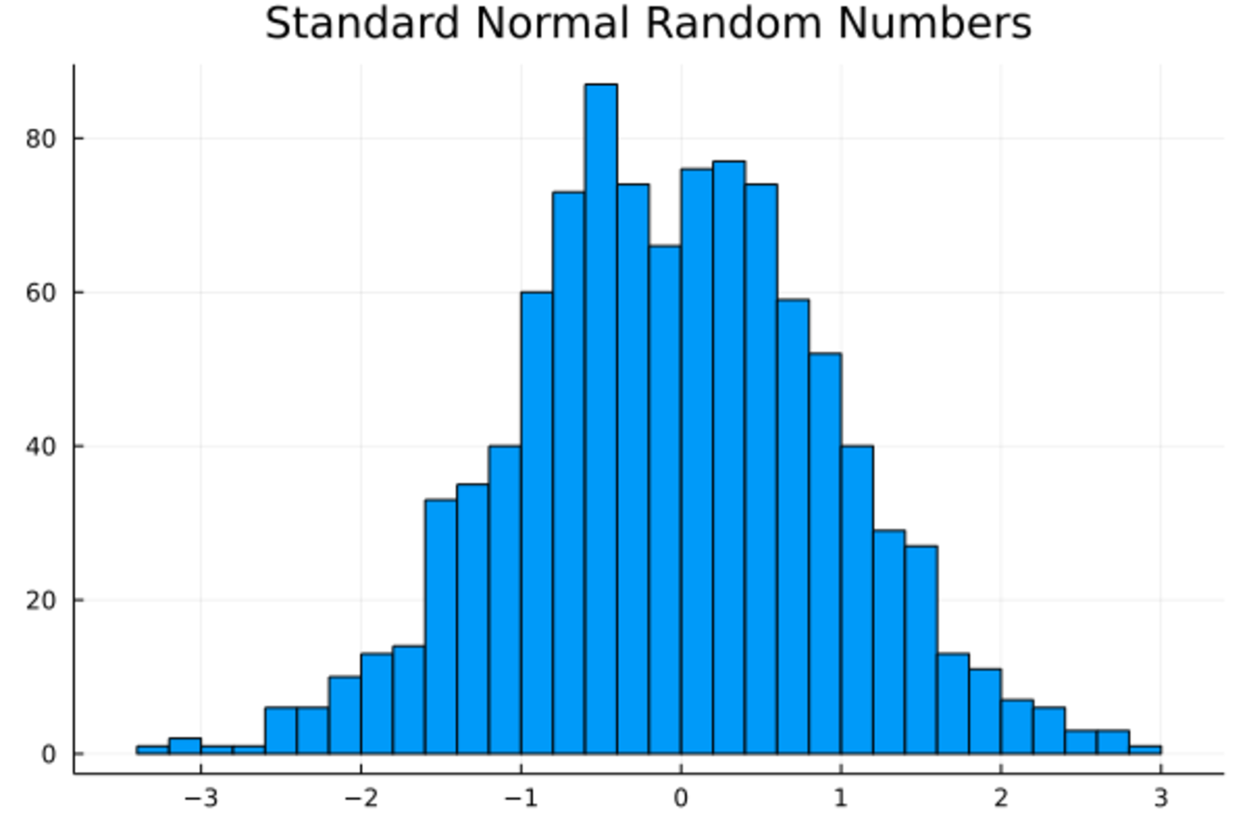
19.12 盒形图
在StatsPlots包支持下可以做盒形图和小提琴图。 比如, 身高的盒形图:
using StatsPlots
StatsPlots.boxplot(["Height"], d_class[!,:height], legend=:none)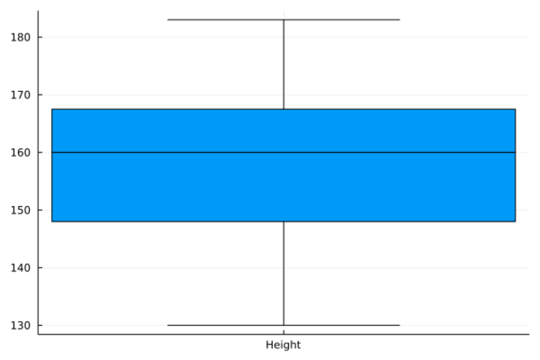
身高和体重的并排盒形图:
StatsPlots.boxplot(repeat(["Height", "Weight"], inner=size(d_class, 1)),
    [d_class[!,:height]; d_class[!,:weight]], legend=:none)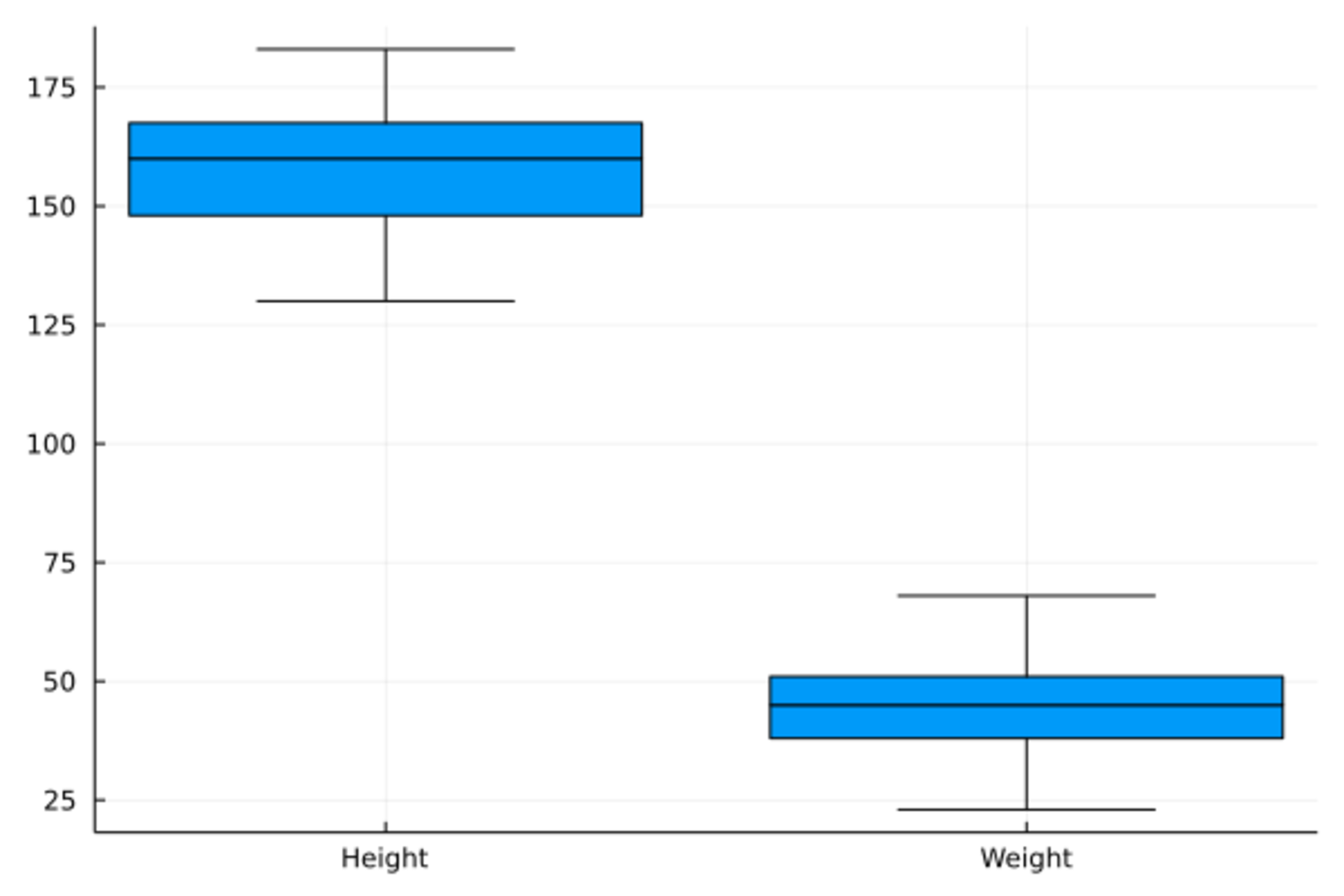
下面是身高的小提琴图。 小提琴图与盒形图类似, 但是盒子的两边是核密度估计曲线。
StatsPlots.violin(["Height"], d_class[!,:height], legend=:none)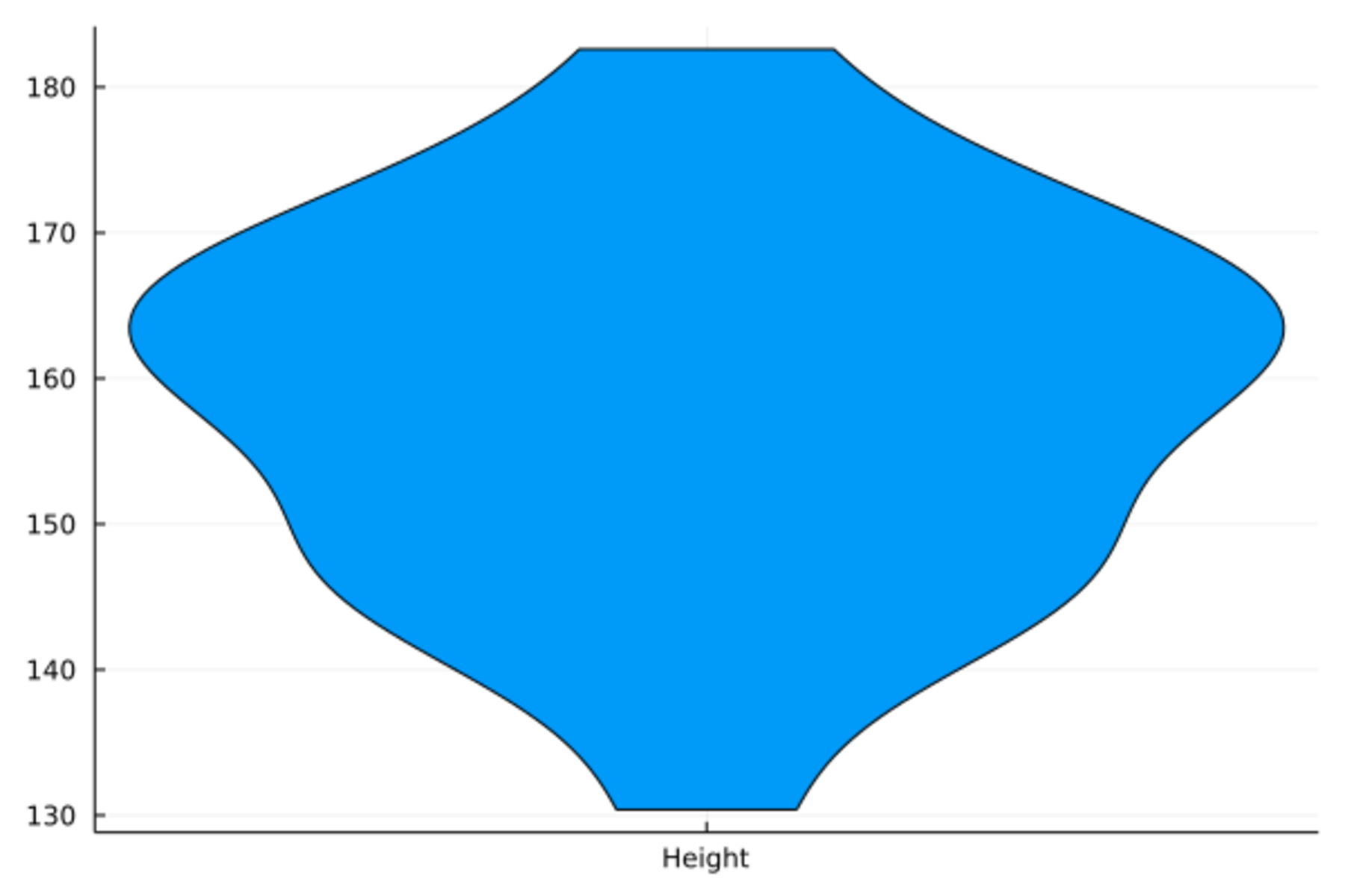
StatsPlots.violin(repeat(["Height", "Weight"], inner=size(d_class, 1)),
    [d_class[!,:height]; d_class[!,:weight]], legend=:none)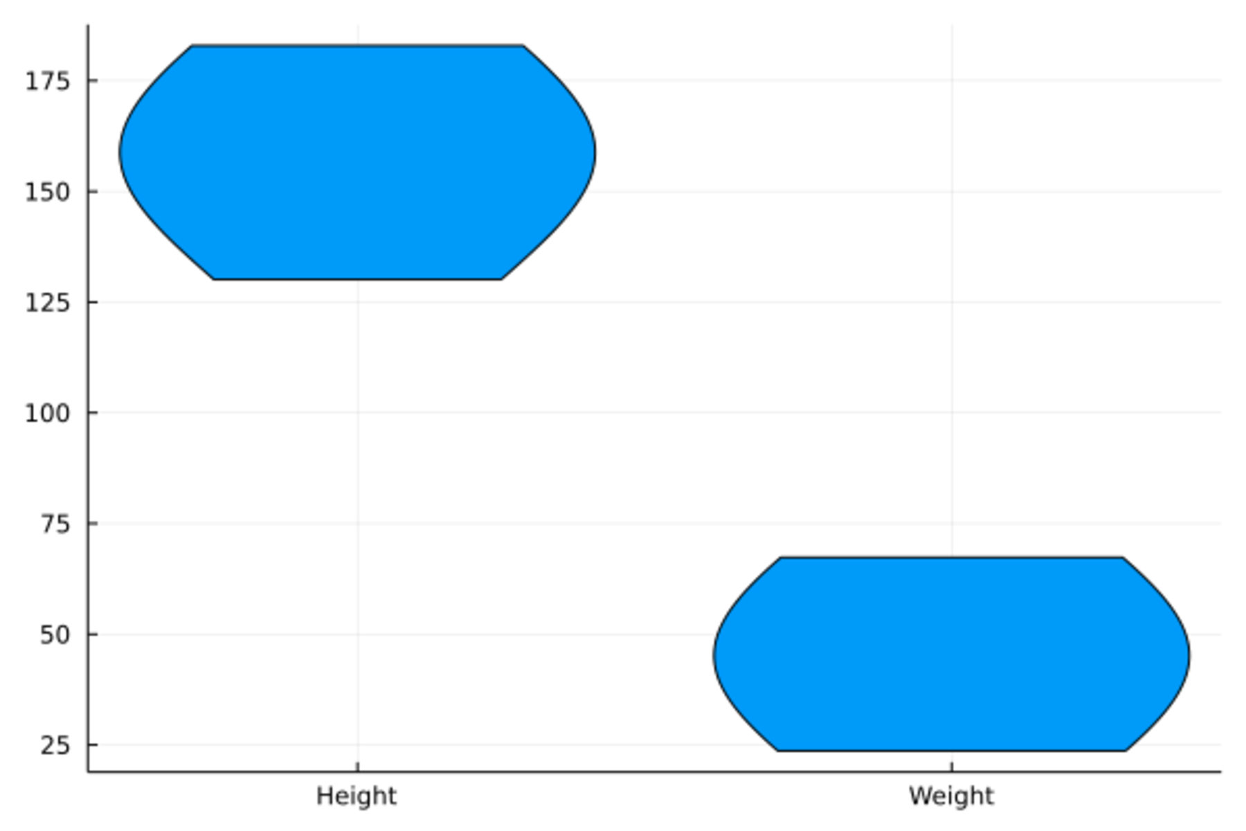
19.13 三维曲面图
surface()函数作三维曲面图。
PlotlyJS后端和GR后端支持这种图。
surface(x, y, z)输入向量x, 向量y,
和矩阵z,
z的每一行对应一个x坐标,
每一列对应一个y坐标。如
n = 50
x = range(-3; stop=3, length=n)
y = x

z = Array{Float64}(undef, n, n)
f_surf01(x, y) = cos(x^2 + y^2) / (1 + x^2 + y^2)
for j in 1:n, i in 1:n
    z[i, j] = f_surf01(x[i], y[j])
end

Plots.surface(x, y, z)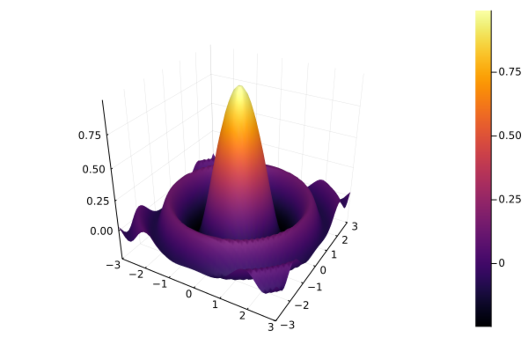
这样的曲面也可以用马赛克形式的“热度图”表现, 用不同的颜色代表z坐标大小,如
Plots.heatmap(x, y, z, aspect_ratio=1)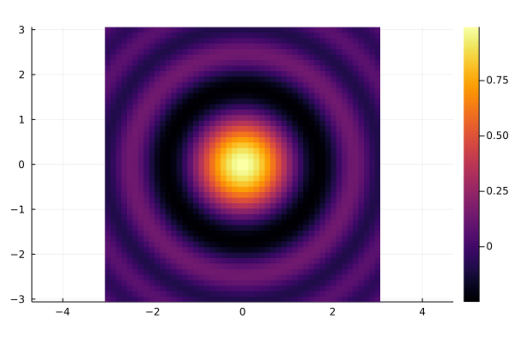
用等高线图表现上面的曲面:
contour(x, y, z, aspect_ratio=1)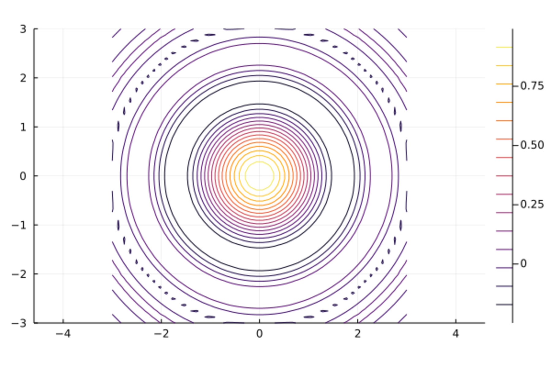
另一个多峰的曲面的填充颜色的等高线图:
x = 1:0.5:20
y = 1:0.5:10
f_surf02(x,y) = (3x + y ^ 2) * abs(sin(x) + cos(y))
contour(x, y, f_surf02, fill=true)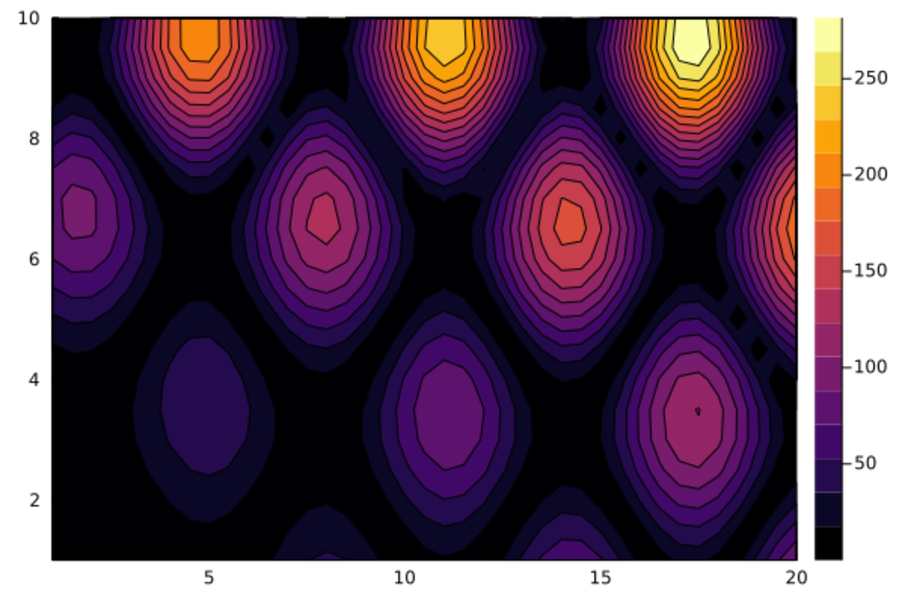
19.14 二维直方图
对于二元随机向量的数据, 作为一元随机变量样本直方图的推广有多种图形。
Plots.histogram2d(x, y, nbins)作矩形马赛克形式的二维直方图,
用每个色块的颜色代表该区域的取值密度大小。
nbins是x轴和y轴分别的格子数。
如
Plots.histogram2d(d_class[!,:height], d_class[!,:weight], nbins=5)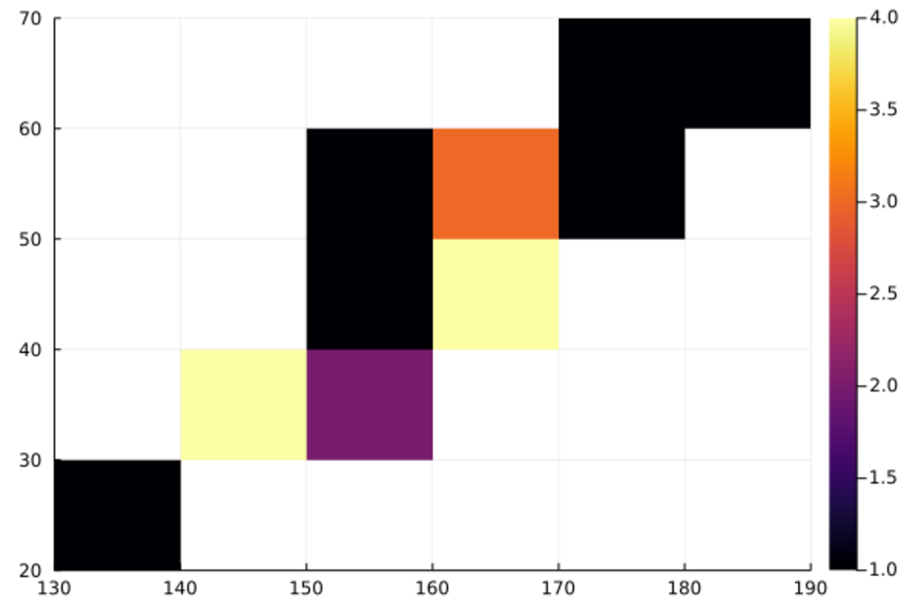
再比如,二元标准正态分布1000个样本点的二维直方图:
Plots.histogram2d(randn(1000), randn(1000), nbins=20)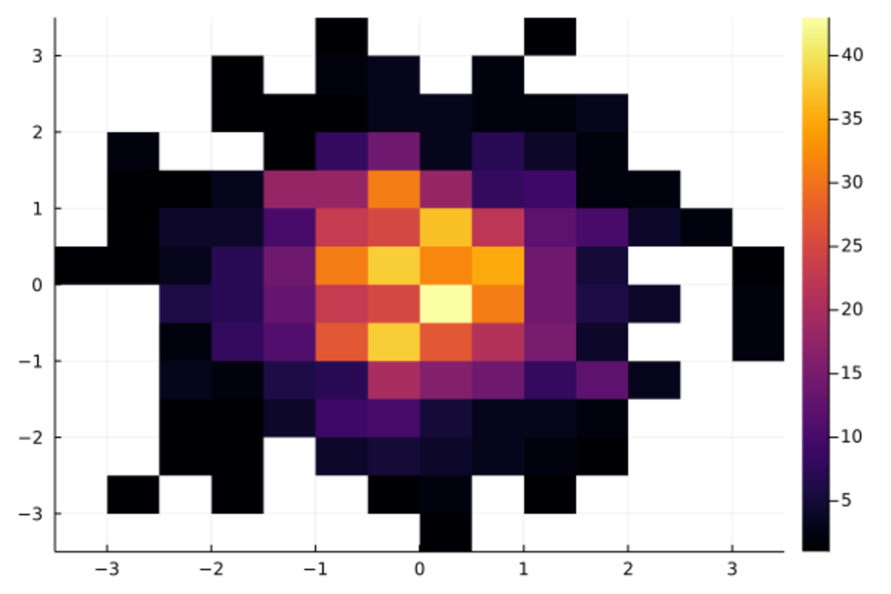
19.15 参数函数曲线
平面上的曲线有些用参数形式表示更方便,如 \[\begin{cases} x = \sin t \\ y = \sin 2t \end{cases} \quad t \in [0, 2\pi] \] 可以在Plots和PlotlyJS(或GR)支持下如下作图:
Plots.plot(sin,x -> sin(2x), 0, 2pi,
    linewidth=4, legend=false,
    fillrange=0, fillcolor=:orange)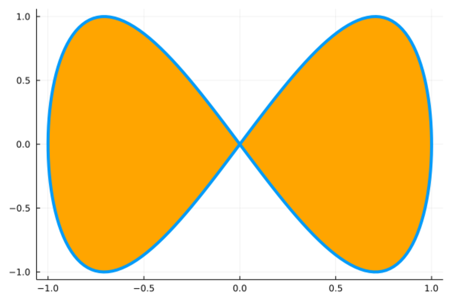
19.16 K线图
Plots包用OHLC()函数作证券价格K线图。
比如,
标准普尔500指数1980年1月份的数据如下:
Mon Day Year Open High Low Close Volume Adjclose
1 3 1980 105.76 106.08 103.26 105.22 50480000 105.22
1 4 1980 105.22 107.08 105.09 106.52 39130000 106.52
1 7 1980 106.52 107.8 105.8 106.81 44500000 106.81
1 8 1980 106.81 109.29 106.29 108.95 53390000 108.95
1 9 1980 108.95 111.09 108.41 109.05 65260000 109.05
1 10 1980 109.05 110.86 108.47 109.89 55980000 109.89
1 11 1980 109.89 111.16 108.89 109.92 52890000 109.92
1 14 1980 109.92 111.44 109.34 110.38 52930000 110.38
1 15 1980 110.38 111.93 109.45 111.14 52320000 111.14
1 16 1980 111.14 112.9 110.38 111.05 67700000 111.05
1 17 1980 111.05 112.01 109.81 110.7 54170000 110.7
1 18 1980 110.7 111.74 109.88 111.07 47150000 111.07
1 21 1980 111.07 112.9 110.66 112.1 48040000 112.1
1 22 1980 112.1 113.1 110.92 111.51 50620000 111.51
1 23 1980 111.51 113.93 110.93 113.44 50730000 113.44
1 24 1980 113.44 115.27 112.95 113.7 59070000 113.7
1 25 1980 113.7 114.45 112.36 113.61 47100000 113.61
1 28 1980 113.61 115.65 112.93 114.85 53620000 114.85
1 29 1980 114.85 115.77 113.03 114.07 55480000 114.07
1 30 1980 114.07 115.85 113.37 115.2 51170000 115.2
1 31 1980 115.2 117.17 113.78 114.16 65900000 114.16
读入数据:
using CSV, DataFrames
d_spd = CSV.read("sp5-198001d.txt", DataFrame, delim=" ")
21 rows × 9 columns
| Mon | Day | Year | Open | High | Low | Close | Volume | Adjclose | |
|---|---|---|---|---|---|---|---|---|---|
| Int64 | Int64 | Int64 | Float64 | Float64 | Float64 | Float64 | Int64 | Float64 | |
| 1 | 1 | 3 | 1980 | 105.76 | 106.08 | 103.26 | 105.22 | 50480000 | 105.22 |
| 2 | 1 | 4 | 1980 | 105.22 | 107.08 | 105.09 | 106.52 | 39130000 | 106.52 |
| 3 | 1 | 7 | 1980 | 106.52 | 107.8 | 105.8 | 106.81 | 44500000 | 106.81 |
| 4 | 1 | 8 | 1980 | 106.81 | 109.29 | 106.29 | 108.95 | 53390000 | 108.95 |
| 5 | 1 | 9 | 1980 | 108.95 | 111.09 | 108.41 | 109.05 | 65260000 | 109.05 |
| 6 | 1 | 10 | 1980 | 109.05 | 110.86 | 108.47 | 109.89 | 55980000 | 109.89 |
| 7 | 1 | 11 | 1980 | 109.89 | 111.16 | 108.89 | 109.92 | 52890000 | 109.92 |
| 8 | 1 | 14 | 1980 | 109.92 | 111.44 | 109.34 | 110.38 | 52930000 | 110.38 |
| 9 | 1 | 15 | 1980 | 110.38 | 111.93 | 109.45 | 111.14 | 52320000 | 111.14 |
| 10 | 1 | 16 | 1980 | 111.14 | 112.9 | 110.38 | 111.05 | 67700000 | 111.05 |
| 11 | 1 | 17 | 1980 | 111.05 | 112.01 | 109.81 | 110.7 | 54170000 | 110.7 |
| 12 | 1 | 18 | 1980 | 110.7 | 111.74 | 109.88 | 111.07 | 47150000 | 111.07 |
| 13 | 1 | 21 | 1980 | 111.07 | 112.9 | 110.66 | 112.1 | 48040000 | 112.1 |
| 14 | 1 | 22 | 1980 | 112.1 | 113.1 | 110.92 | 111.51 | 50620000 | 111.51 |
| 15 | 1 | 23 | 1980 | 111.51 | 113.93 | 110.93 | 113.44 | 50730000 | 113.44 |
| 16 | 1 | 24 | 1980 | 113.44 | 115.27 | 112.95 | 113.7 | 59070000 | 113.7 |
| 17 | 1 | 25 | 1980 | 113.7 | 114.45 | 112.36 | 113.61 | 47100000 | 113.61 |
| 18 | 1 | 28 | 1980 | 113.61 | 115.65 | 112.93 | 114.85 | 53620000 | 114.85 |
| 19 | 1 | 29 | 1980 | 114.85 | 115.77 | 113.03 | 114.07 | 55480000 | 114.07 |
| 20 | 1 | 30 | 1980 | 114.07 | 115.85 | 113.37 | 115.2 | 51170000 | 115.2 |
| 21 | 1 | 31 | 1980 | 115.2 | 117.17 | 113.78 | 114.16 | 65900000 | 114.16 |
using StatsPlots
df2OHLC(df) = OHLC[(df[i,:Open], df[i,:High], df[i,:Low], df[i,:Close]) for i in 1:size(df,1)]
StatsPlots.ohlc(d_spd[:,:Day], df2OHLC(d_spd[:, [:Open, :High, :Low, :Close]]))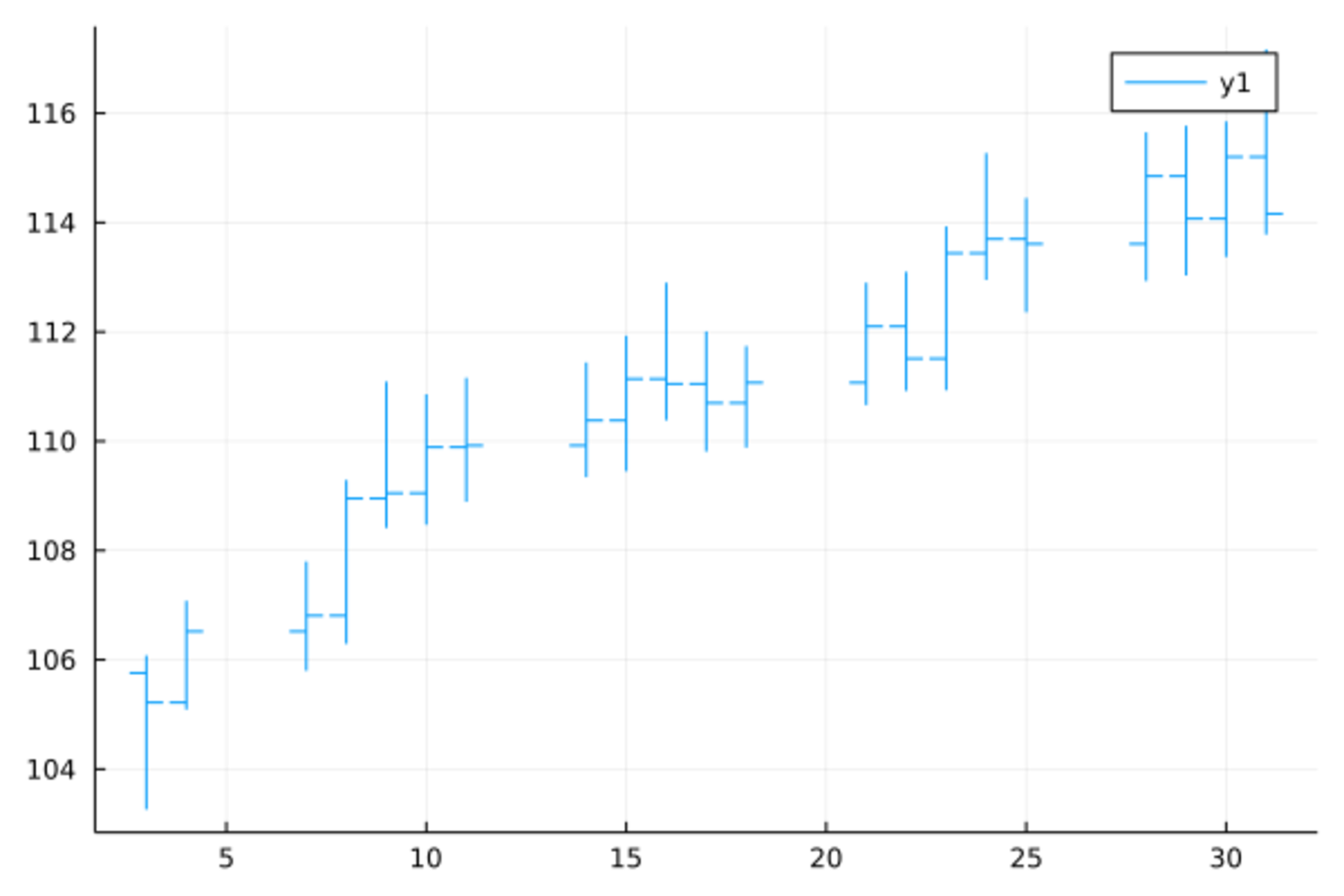
这种图的每个符号的下端为最低,上端为最高,左边短线为开盘,右边短线为收盘。
19.17 标注
可以用Plots.annotate!()函数添加文字标注,
位置坐标采用原图的坐标系,
内容包括文字和文字的颜色、字体、大小等属性。
如
Plots.bar(1:10, (1:10) .^2, xticks=0:10, legend=false)
Plots.annotate!([(x, x^2 + 5, text(string(x^2), 16, :red, :center)) for x in 1:10],
    xticks=0:10, ylim=(0, 110), legend=false)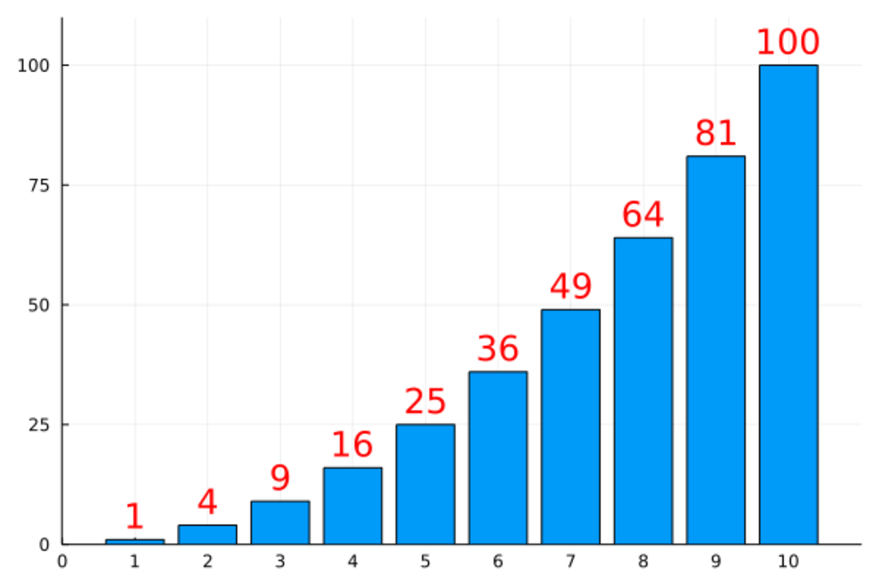
标注内容是元组的数组,
元组的前两个元素是一个标注的横、纵坐标,
第三个元素是用text()函数构成的文字与文字属性,
text()中的字符串变量是要标注的文字,
整数值是字体大小,
颜色符号为颜色,
:center、:left、:right为对齐方式。
19.18 动画图
Plots包可以通过制作动画GIF来实现动画图, 实际是做多幅图, 将每幅图作为动画的一帧。
可以用@gif或者@animate宏制作,
@animate更灵活,
@gif较为简单易用。
在Windows下测试失败,
应该是Linux下的功能。
例如,制作相位连续变化的正弦波图形:
using Rsvg
@gif for phi in linspace(0, 2*pi, 30)
    Plots.plot(x -> sin(x - phi), 0, 2pi )
end
或者
using Rsvg
anim = @animate for phi in linspace(0, 2*pi, 30)
    Plots.plot(x -> sin(x - phi), 0, 2pi )
end
gif(anim, "sine_wave.gif", fps=3)